I personally prefer the S, but all of these are great really. Considering it’s so close to being an S I feel like a lot of people are going to notice that too, but I might be wrong. It was also discussed a little previously: https://slrpnk.net/post/9709041
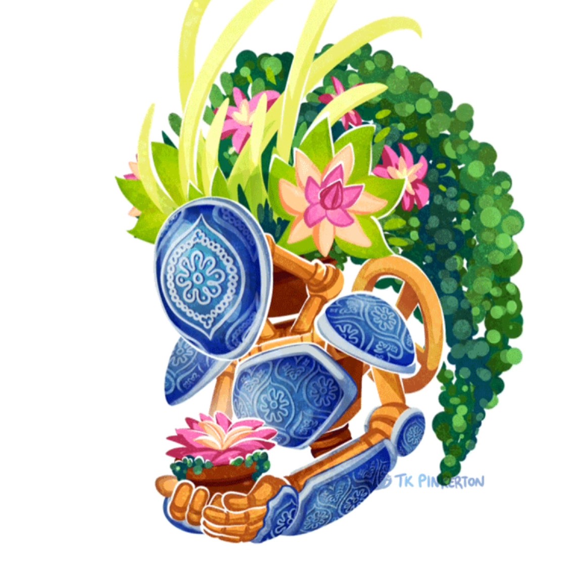
Would also be interesting too see a version of this the other way around. E.g. The plant bit switching position with the gear bit. But thinking about it - it might not make as much sense as plants usually grow upwards(?)
I actually like that simpler version much more as an S, something about the increased whitespace around the dot in that version compared to the sun in this version looks a bit better to me. The framing around it helps a bit too, though as you say, all of them a pretty cool.

I personally prefer the S, but all of these are great really. Considering it’s so close to being an S I feel like a lot of people are going to notice that too, but I might be wrong. It was also discussed a little previously: https://slrpnk.net/post/9709041
Would also be interesting too see a version of this the other way around. E.g. The plant bit switching position with the gear bit. But thinking about it - it might not make as much sense as plants usually grow upwards(?)
Flippy test!
Hmm, I think that design might need something more bespoke.
There are those upside down tomato planters.
I actually like that simpler version much more as an S, something about the increased whitespace around the dot in that version compared to the sun in this version looks a bit better to me. The framing around it helps a bit too, though as you say, all of them a pretty cool.
Actually, the more I look at it the more I agree with you. Thanks for trying out the different variants. I really dig this logo 💚💛