

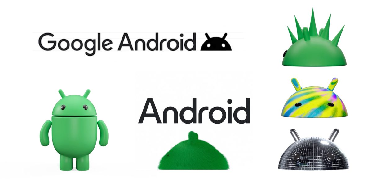
Following our previous report, Google is officially unveiling a new 3D logo for Android. The broad goal of this updated branding is to “help connect Android to Google,” and it follows the previous modernization in 2019.
You must log in or register to comment.
Hey finally a change to the boring minimalist 1 colour 2d logos every company has these days! Back to the good old days!
We’re going full circle
looks like the kind of trash cans you see downtown
gonk droid!
deleted by creator
Aesop’s fables
Logos are supposed to be easily reproducible at any size. This is a terrible idea.
Other key thing about logos is that they are suppose to look clear in black and white. Which this isn’t.
Like the small logo and the black and white logos seen above?
Good point, but that wasn’t changed from before, right?
That one is the one they’ll use when you need a B&W logo
Don’t really care how the Android logo looks, I just wish Google would fix the ridiculously oversized quick toggles and unnecessary whitespace they added in Android 12.
Oh, and the nesting of mobile data/WiFi toggles under another layer.
our green lemmy icon is better, imo
You’re just saying that because you made it and it won the contest.
I don’t disagree with you though.
I wonder if pseudo-3D app icons will come back.
Please no… not the skeuomorphism!
I’ll add metallic reflections driven by your phone’s gyroscope to every one of your icons and you can’t stop me muahahahaha
Oh no, Google. Oh no…

Android for kids
I thought enshittyfication was about paying more for less, not terrible logos.
Removed by mod
sad WordArt noises
But how will the new middle executive justify their promotion?
Oh wow that looks awful.
I like the old design more because it felt a bit more playful, with the lowercase a and simple droid being welcoming and not way too professional. This makes it really generic and brand-y.
Am I the only one who actually likes the new logo?
I still prefer how it was back in 2014.
This looks like one of those random off topic images you find when searching for something.