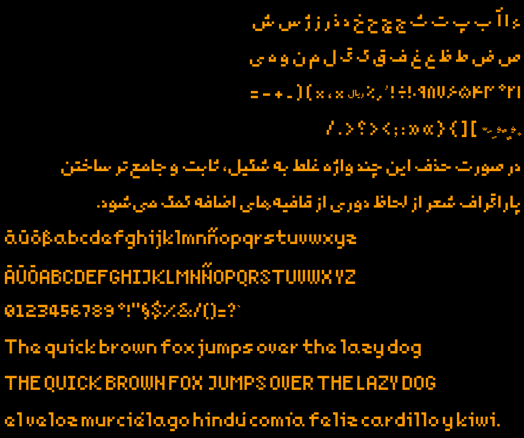
Last year I made a new pixelated free typeface for my 2d game. It has Arabic, Persian, and a subset of Latin glyphs enough for English, German and Spanish texts. Inside the repo you’d find makefile to build the font and generate test outputs.
Since it was my first experience designing a typeface ever, I might have made mistakes not known to me. That’s why I post this, hoping someone would point them out. Here is the repo
Good catch with ß! I’ll fix that.
Regarding the double dots however, it’s a deliberate design choice (constraint). Double and triple dots in Persian glyphs (extended Arabic) are the same.
The rationale is so: I have one base unit which is a fixed size dot which is a glyph itself and every other glyph is made of that. All glyphs also use absolute minimum possible number of dots, and the space between them is also is a multiple of its size. I hope that users could understand it correctly in the context.
Thanks for the feedback, much appreciated.