 I kinda like the way this looks as it makes the script predictable but I still feel like it could really be improved
 These two are pretty bad in my opinion as I can’t really tell where the dots are meant to be and it looks very overcomplicated.
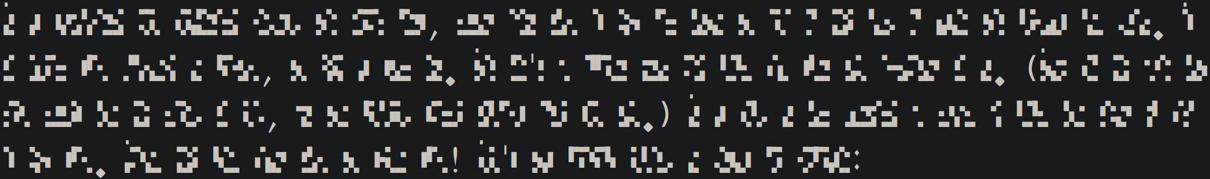
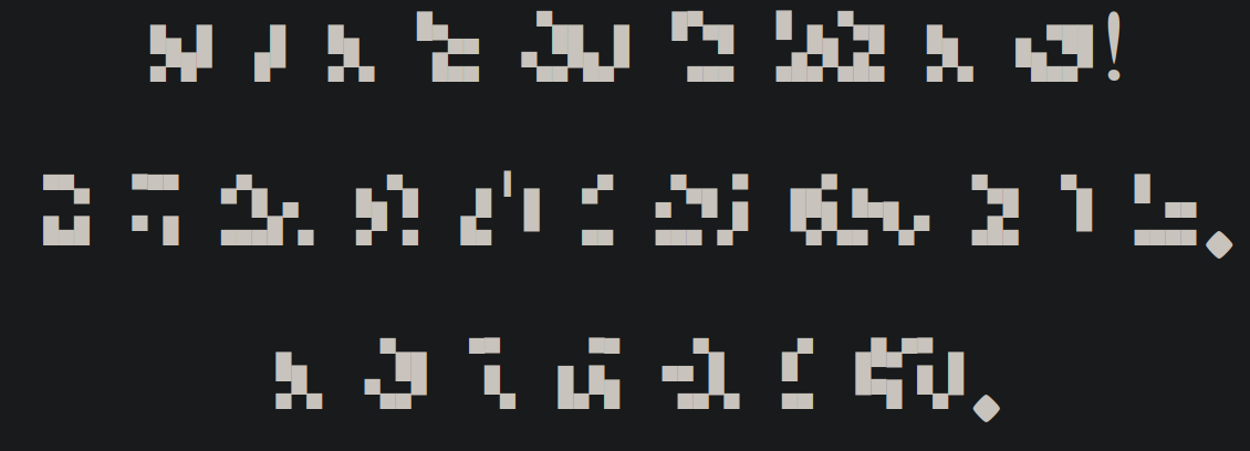 This is the original font and I believe it can be easily written (unfortunately my artistic skill is pretty low).
That would probably help but also make everything merge together a bit