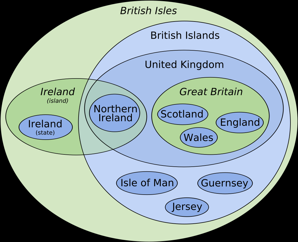
@[email protected] to Data Is [email protected] • 1 year agoEuler diagram of the terminology of the British Isleslemmy.sdf.orgimagemessage-square121fedilinkarrow-up1499arrow-down113file-text
arrow-up1486arrow-down1imageEuler diagram of the terminology of the British Isleslemmy.sdf.org@[email protected] to Data Is [email protected] • 1 year agomessage-square121fedilinkfile-text
minus-square@PlutoniumAcidlink2•1 year agoSpeaking of! Shouldn’t Australia be in that chart too? And I’d like to see the “commonwealth” in the diagram too. It’s all good complicated!

Speaking of! Shouldn’t Australia be in that chart too? And I’d like to see the “commonwealth” in the diagram too. It’s all good complicated!