
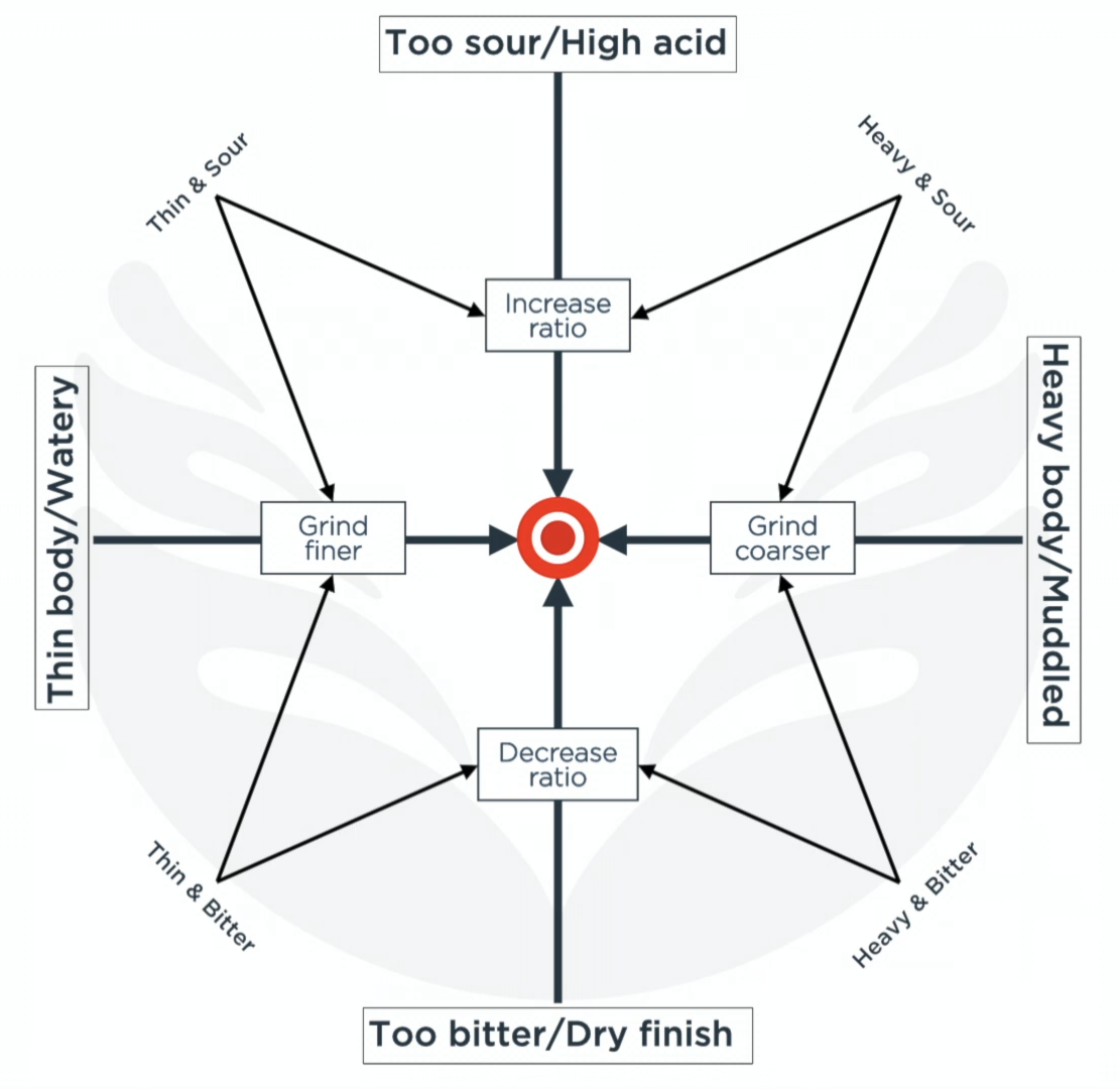
Don’t know how many people have run across this or something like it before. This visual helped me early on and I still think about it if I have a really bad brew.
edit: uploaded higher res image from a non-problematic source.
New image credit: Homegrounds
I wish it had higher resolution
Nice
I wish this had higher resolution too.
Is this due to Lemmy recompressing it?
I want to believe OP wouldn’t do this to us…
I promise I did not do this on purpose. I like potatoes but not potato quality.
Uploaded via memmy which maybe did some jpeg compression. Still getting used to the new world. Need to figure out a better image upload/hosting pattern
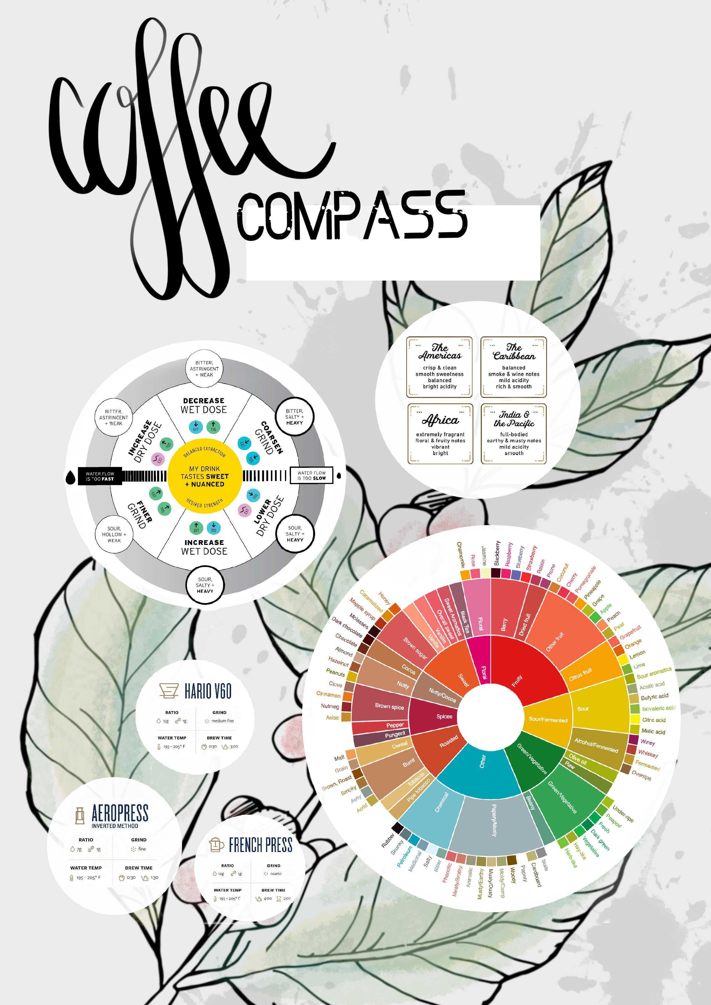
Here’s a few I’ve saved over time, all variations on the same thing. Unfortunately I haven’t saved the sources alongside them: apologies to the creator as I know at least one of them was made by someone on Reddit
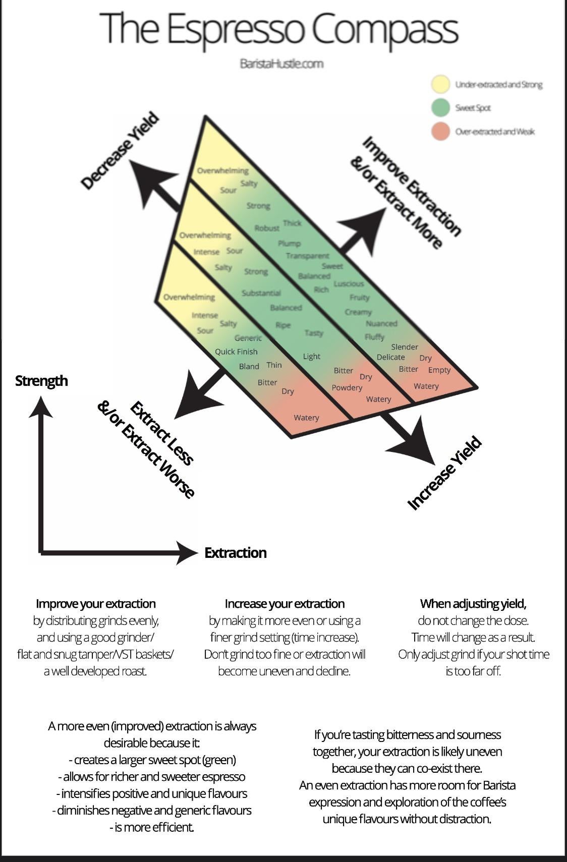
Very nice! I’ve used this interactive one from Barista Hustle a few times.
It’s conceptually useful but I have some qualms about promoting Barista Hustle
Noted, had no idea
Do you have this at a higher resolution? It’s better than the other graphics to the same effect but so small I can barely read it.
Fixed, similar graphic from different source with higher res uploaded
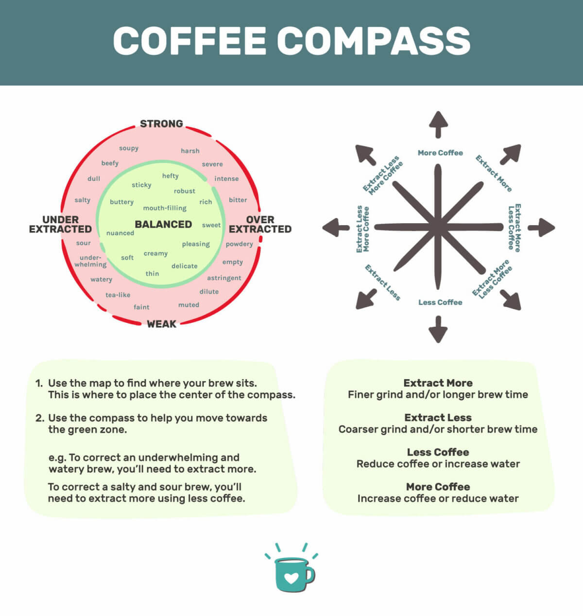
Thank you! I stumbled on this once and couldn’t find it again.
How can someone standardise “sour” or “bitter” or etc? Every person has their own perception of tastes.
I don’t mean to be salty (pun intended), but it still confused me…
a non-problematic source.
Plagiarism seems pretty problematic to me, but then, so does racism so 🤷♂️
Where’s the plagiarism here?
The original image was (presumably) Barista Hustle’s coffee compass. The ‘non-problematic’ replacement is just a straight copy of it, word for word and almost identical in design. Not a big deal but ehhhh

