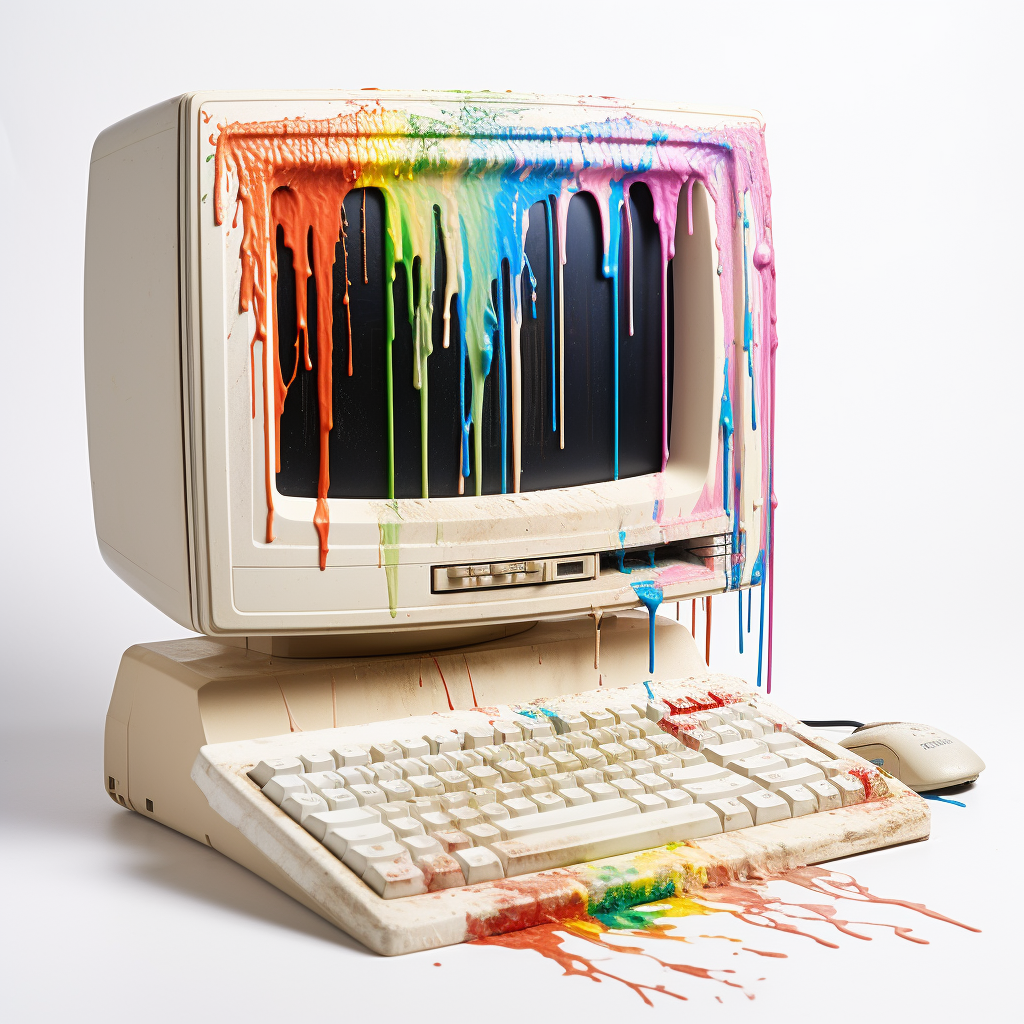
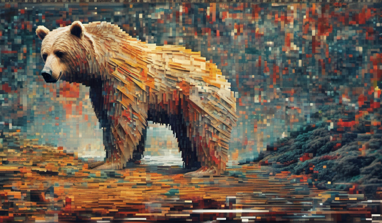
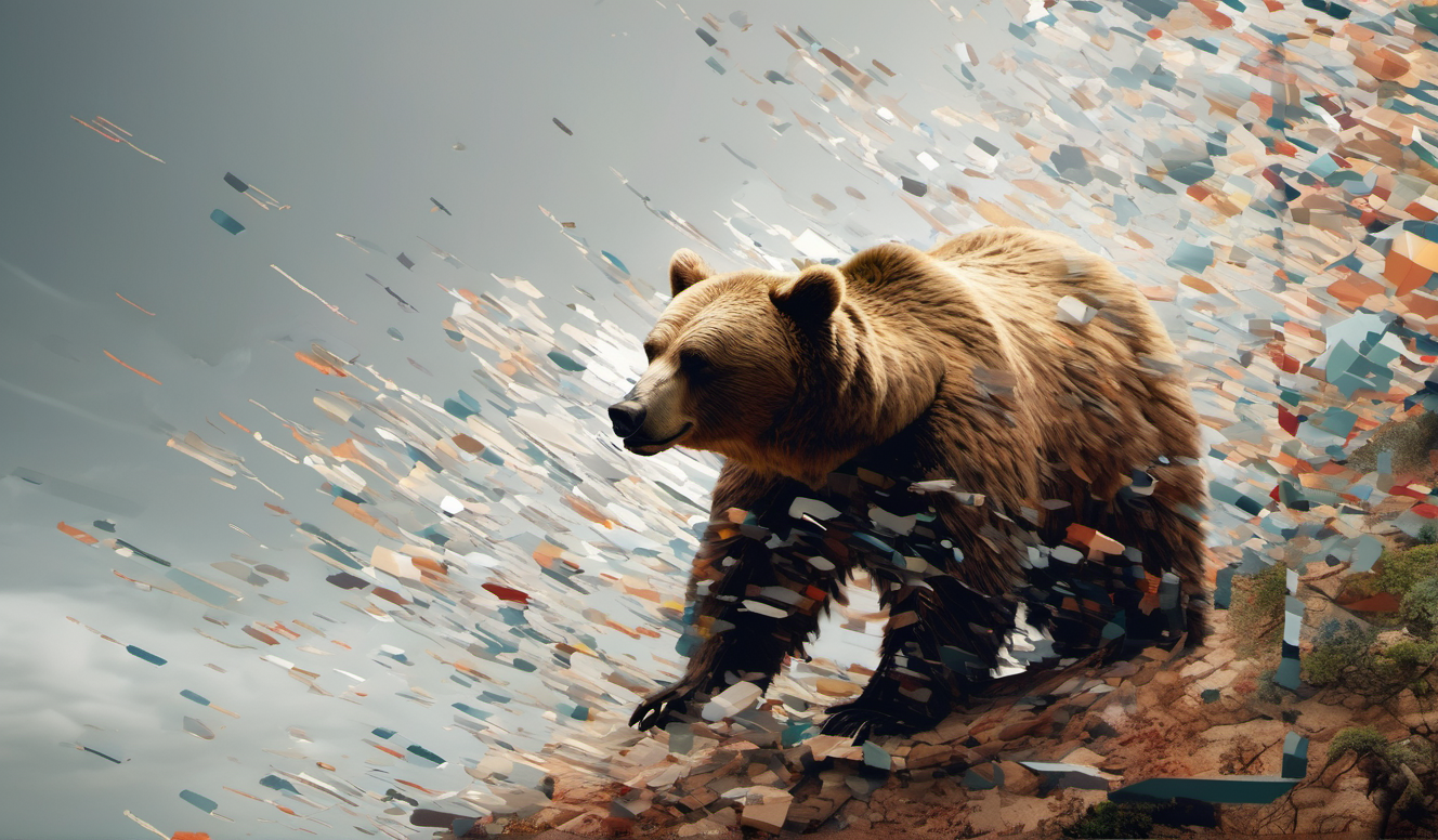
I’m getting closer. I haven’t made a Lora yet but this was made with the SDXL model and it’s pretty good.
Thoughts?
Other versions:



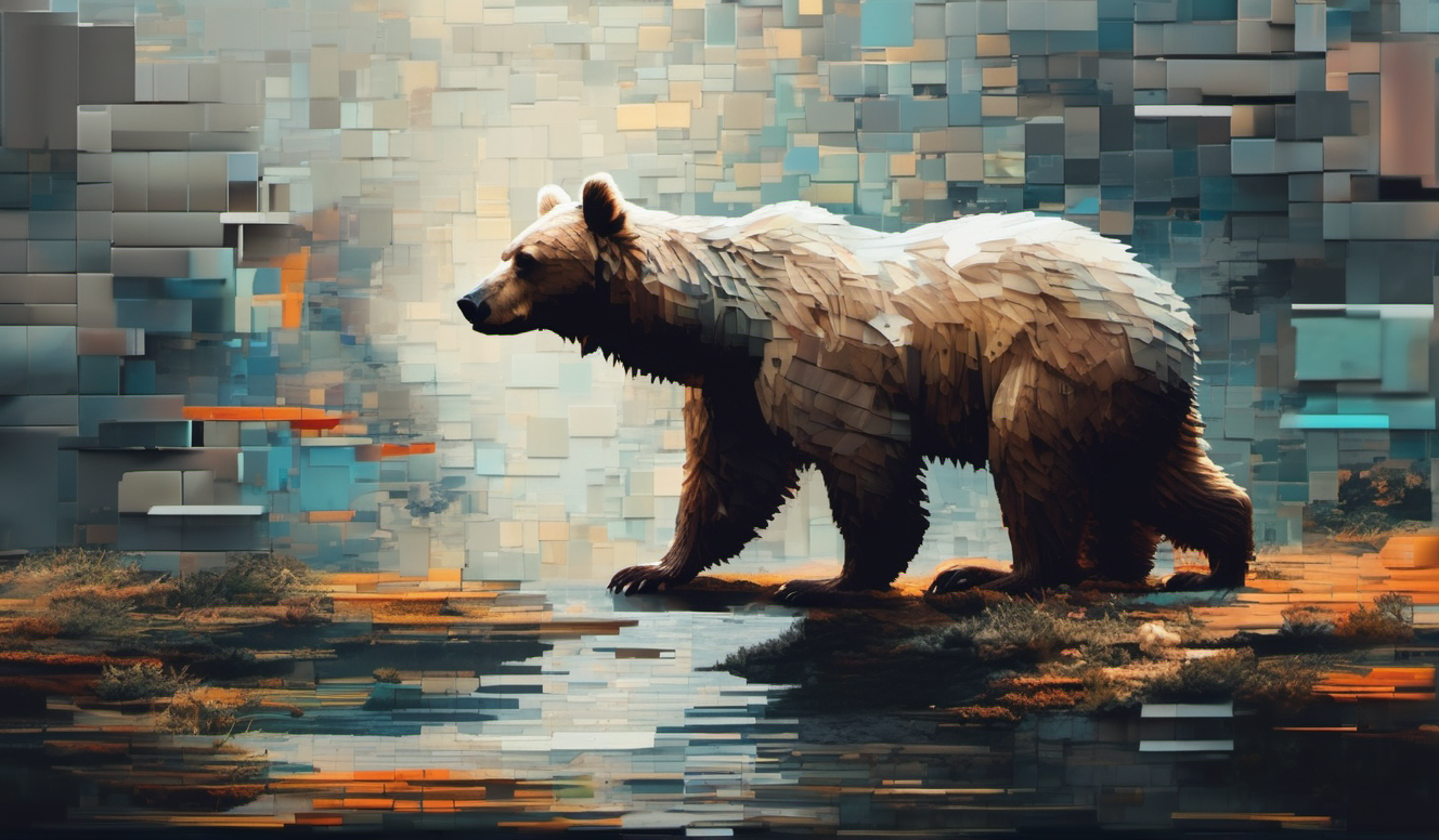
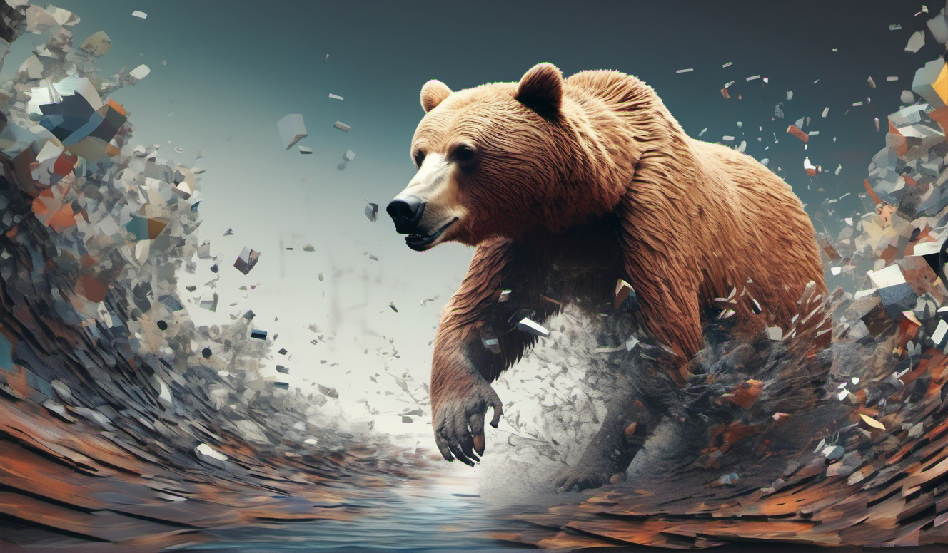
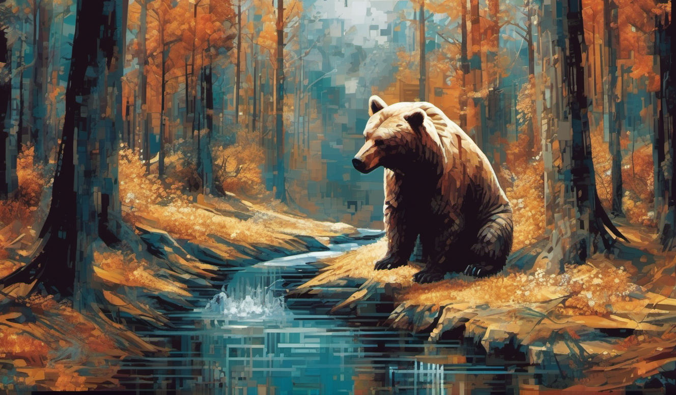


How’d you do it?
I used the latest SD XL model which was the real trick, then I typed what I was looking for in the scene and used the below in the style selector. Then I did a million iterations and saved the ones that I liked best.
Fragmentation: Instead of a smooth, cohesive image, the subjects are broken into fragments or blocks that appear to be disintegrating or exploding away from the central focus. This could be interpreted as a metaphor for the transient or impermanent nature of the subject matter. Pixel Distortion: There's a visible distortion where the pixels do not align in a standard grid pattern. Some pixels may appear elongated, oversized, or scattered, which contributes to a sense of motion or disarray. Color Variation: The pixel fragments vary in color, often in a gradient that suggests depth and dimension. The colors may also contrast sharply with the rest of the image, drawing attention to the areas of pixel disruption. Digital Aesthetics: The use of pixelation is a nod to digital art and the intrinsic properties of digital displays. It plays with the idea of digital imperfections and can be seen as a commentary on the digitalization of modern life. Contrast with Realism: Often, the subjects of the images are rendered in a realistic manner, and the broken pixel effect disrupts this realism, creating a juxtaposition between the real and the digital or between order and chaos. Dynamism and Movement: The style often imparts a sense of movement or explosive dynamism, as if the subject is bursting into or out of the digital realm. This can create a visual impact that suggests action or transformation. Layering: There is a layered effect, with the pixelated fragments appearing to hover above or below the main image, adding depth to the artwork. Surrealism: The combination of realistic subjects with the abstract pixelation creates a surreal effect, blurring the lines between the tangible and the imagined, the physical and the virtual. Disruption of Form: The subjects in each image have portions that are distorted by what appears to be a digital error. The forms seem to disintegrate into or emerge from an array of pixels or digital artifacts. Contrast between Clarity and Distortion: There is a clear contrast between the detailed, realistic areas of the image and the sections where the 'broken pixel' effect is applied. The realistic parts could be anything from a human figure to an animal or a natural scene, but they transition into abstract pixel patterns. Directional Flow: The pixelated areas often have a directional quality, giving the sense of movement or flow. In some cases, it appears as if the pixels are being pulled in a certain direction, like a digital wind blowing them away. Color and Texture: The pixelated areas often show a variety of colors that may or may not correspond to the original color scheme of the subject. The texture appears as a juxtaposition of small squares or rectangles, resembling a corrupted digital screen or a mosaic made of digital noise. Layering and Depth: There is a sense of layering, with the pixelated areas sometimes appearing on top of or beneath the clear parts of the image. This creates a depth that adds to the three-dimensional feel of the artwork. Digital and Organic Fusion: The style blends digital elements with organic subjects, creating a hybrid that speaks to both the digital age and natural forms. It's a commentary on the intersection of technology and organic life. Emotional Impact: The broken pixel effect can evoke various feelings, such as the sense of decay, transformation, or the idea of being overtaken by digital processes. It can also signify the transient nature of digital media and the fragility of digital storage and memory.That is a huge prompt. Did you use any negative prompt or LoRA?
Nothing in negative. And it is huge but it’s all in the style so I don’t see it in the prompt window.
You should try adding attention to tokens. If you highlight the words you want to add attention to and press Ctrl + Arrow key up or down, you can change the amount of attention on those tokens and get some interesting effects. Past 1.5 attention things get a little weird, but that might be what you’re looking for.
I’ve learned that since writing these. And I haven’t taken the time to redo them.
I see.
