
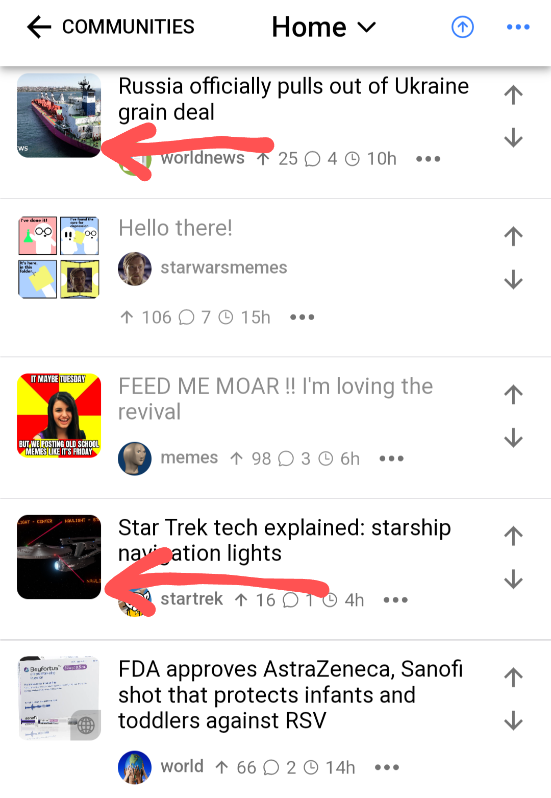
There’s a little globe icon added in the bottom-right corner of external links, so you know that tapping the thumbnail will open a link rather than an image preview, but in its current form it’s hard to see against darker thumbnails.
The posts I’ve highlighted with arrows in the image are both links, but it’s almost impossible to tell.
I wish the icon would indicate if it’s a video vs a webpage or photo. Can’t tell you how many times I click an image I think is just a webpage or image hosted elsewhere and I end up in YouTube. I’m not always in a place where I want a video to start playing.
Yeah, a confirmation pop-up (or at least the option for one) when you tap on a link would go a long way to helping with that.
There’s an open pull request for this https://github.com/aeharding/voyager/pull/415
This seems to be fixed now! 💪
Yep! Looks much better now.