- cross-posted to:
- [email protected]
- [email protected]
- cross-posted to:
- [email protected]
- [email protected]
So canvas is on again this year! We could try and be a bit more organised this time if people are around
I’ve not started anything yet
Also can we go behind the Dead Cells hand, please!! specific over general!!
Got it 👍
This link should set you up with the template and stuff! COME JOIN
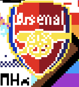
main arsenal badge is done!
what do we want to do about the progress pride flag bit cutting into us? i kinda don’t want to cut out the trans bit but also it’s in our way
if we do the template fully we end up with like, one pixel of pink lol
As long as it works on mobile I can help :D
negotiating to make the chevron of the progress pride flag more visible, can we turn the red bits that intersect into the pride flag please!!
probably just that corner there beneath the cannon, we don’t really have a template so kinda winging it lol
Is it down for anyone else? I just see a blank canvas.
It’s back, baby!
element’s starting to struggle for me :p
Oo, this should be fun. I don’t know if we have the personnel to make something too big, but we could maybe do something other than the badge this time lol. Any suggestions?
Yeah obviously the badge is an easy option given they’re already templates we can use out there
One thought I had was maybe to do a version of the patchwork strip from a few years ago, but we’d need to figure out how to turn it into a template that doesn’t look rubbish
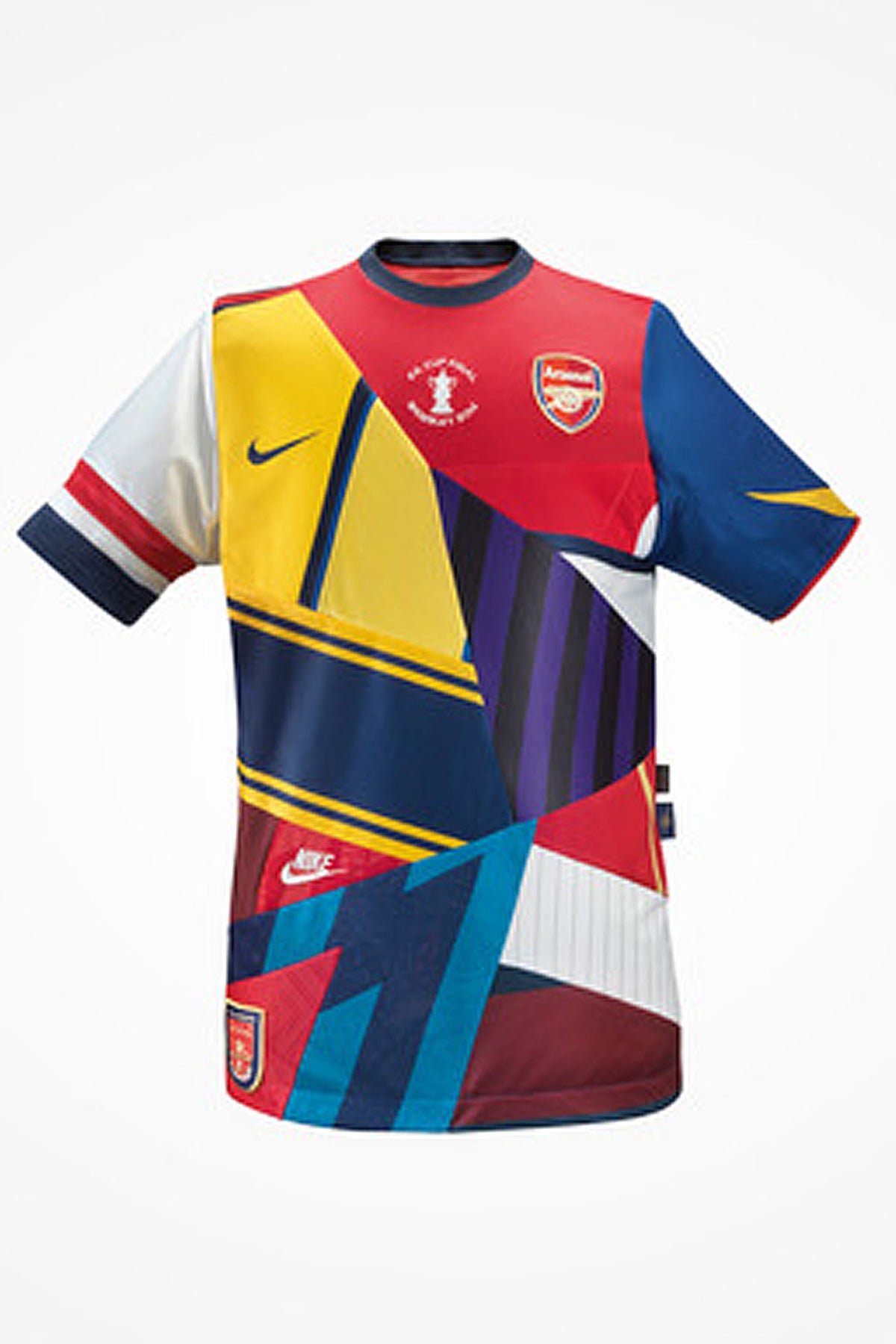
Gonna start with this one we used last year, there’s a spot somewhat near the gay / nato flags imma use around (167,58)

I was thinking if we have the personnel etc. we can try to do this A as well? and also text announcing us lol
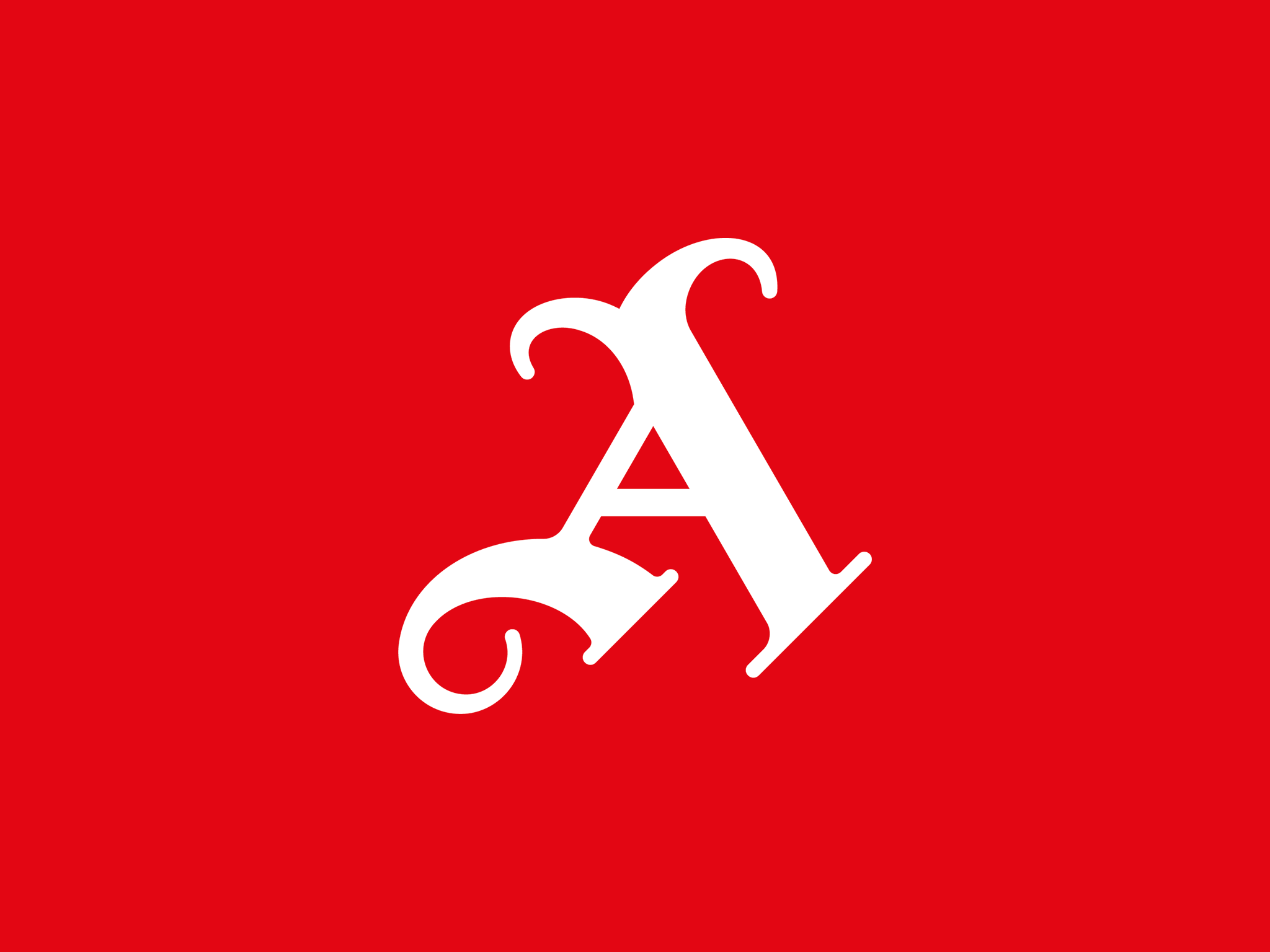
Have we started on this yet? It looks like the canvas has been expanded, so might be a good time to claim a spot for it!
nope, go ahead! i’m working on the hong kong flag
Have you got the exact settings you put into the template screen? (Width, X & Y most importantly)
nah i have no idea how to do the template thing, i’ve been copying manually lol
Oh lol, fair play, I’ll figure it out and post the details in a bit then
Okay so
URL: https://lemmy.world/pictrs/image/96b7cdff-b8dd-4629-8784-0a6ba396d61f.png
Width: 35
X: 161
Y: 67
And set the opacity to something under 50%, change the template style to “source”
Looks like we might get some clashes at the edge
Edit:
New coordinates: X: 125 Y: 2Edit 2: back to the original ones
peace flag seems to have a lot of people working on it, on the other hand idk if there’s a better spot
Yeah I was gonna say it might be worth considering moving, we’re getting removed already
X: 125Y: 2Looks goodEdit: sticking with the original location
we’re good to stay original spot
only thing is I’m realising this might cut up the dead cells art but also I don’t even remember there being any indie game communities every time i’ve tried to look for them so uh. it’s fine probably
I think we used this, anyway. Not sure tbh.
Yeah that looks familiar, I’ll be able to contribute properly once I’m done with work
which blue looks better? i was thinking to use the darker blue on the darker side might look better but now i’m not as sure
I’m working my way around the border of the cannon between work meetings :D
accidentally refreshed and my pixels display are kinda fucked up now, fun
prolly gonna sleep, it’s late, keep going tho y’all
I wish I could help this year, but this is literally the worst possible timing for me. I’m at a large and very busy family reunion this weekend. Godspeed lads!
kinda want to do the hk protest flag personally now that the arsenal badge is done and i wouldn’t mind some help https://canvas.fediverse.events/#x=542&y=116&zoom=6&tu=https%3A%2F%2Flemmy.world%2Fpictrs%2Fimage%2Fa3f0c0c0-8904-4563-99fc-35c163614807.png&tw=60&tx=500&ty=247&ts=ONE_TO_ONE
have been informed that this overlaps with Loss so i’m moving down a bit

