
Seems like an appropriate thing to post here.
I get unsolicited options from bystanders about this all the time. Dude, why are you trying to look at my phone screen anyway?
You must log in or register to comment.
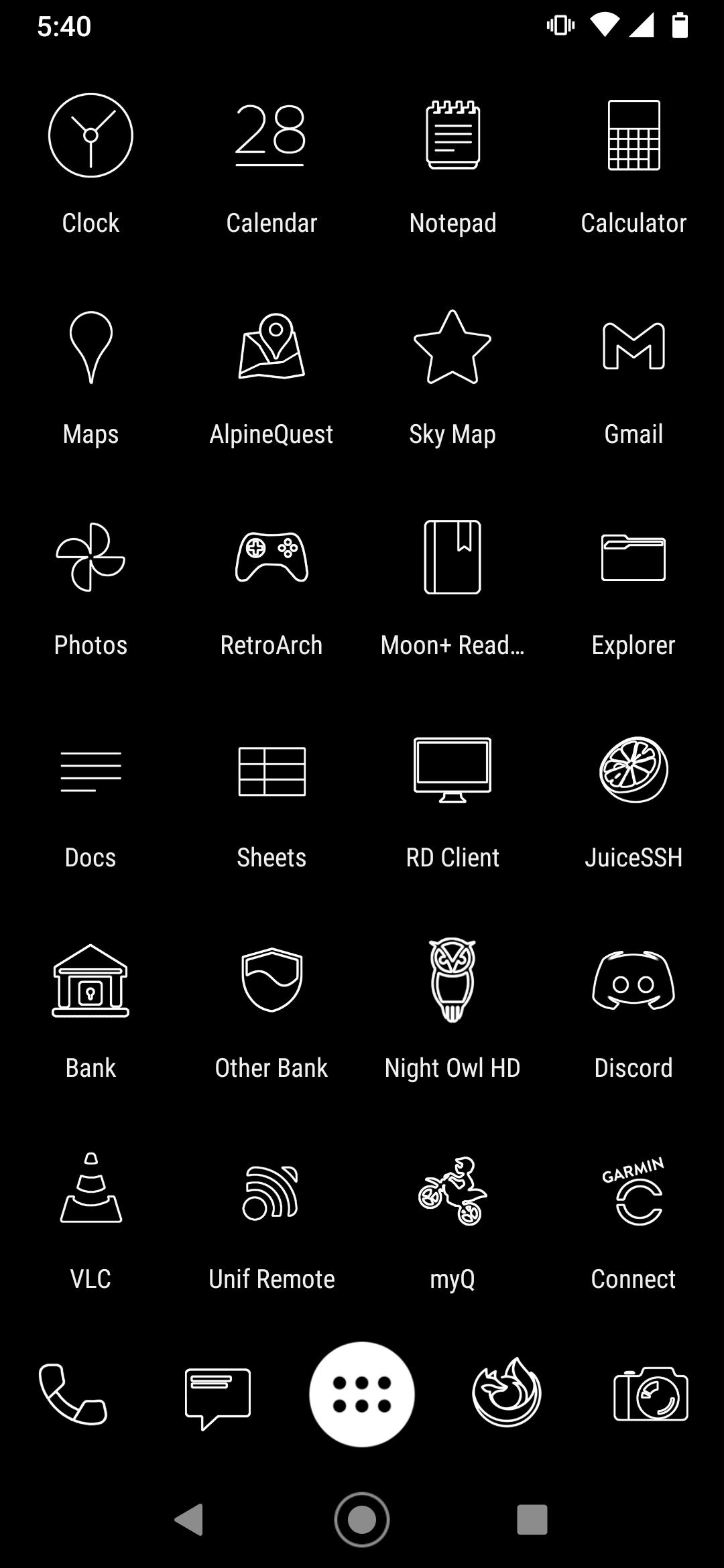
What a duality, It’s both messy and organized, minimalistic and cluttered, black and white, I love it and hate it.
Seems uptight. Staged. Unlived in. Needs 40 thousand unread emails and a bunch of other ignored notifications. That’d be believable.
Looks nice and clean.
I personally need logo colors to quickly find an app, but I’d never tell a rando what to do with their own damn phone lol.
How does one get this? Asking for a friend.
I use Nova Launcher for my home screen. The icon pack is “Lines Free,” by Nate Wren Design.
Back in the bad old days of Windows 95 I used to make my own icons for everything using Microangelo but these days I can’t be bothered. The same author has various other icon packs, some of them minimalist, some of them not.
I mean, it’s not my style but you do you.
This is the benefit of android and other more open OS’
Rock it!
Unsolicited options? What, are they asking you to consider increasing your line thickness or something?
It reminds me of Astroids. I want it, lol
It’s cause you use moon+ \hj
Moon+ is awful in it’s design. It’s TRYING to be MD3, but it’s just trash.
P.S.: Looks cool and clean but not my style
Removed by mod
I love it! It’s inspiring me to add custom icons to my own launcher…
Its clean, but these app drawers are unintuitive to me. I have Niagara and I love having just an alphabetical list.
To be honest, the drawer is only there for the once-in-a-blue-moon time I need to run some obscure thing I hardly ever use. What’s on that desktop is basically all I ever use my phone for. I’ve got things arranged roughly by frequency of use to thumb distance.
I meant more in general rather than your’s specifically. Your style is completely fine. Mine is similar except my outline icons are colored and I have a list instead of a drawer. So you got good taste lol
Be super keen when app makers can actually be bothered to implement Android adaptive icons (so that when you enable themes their icons automatically adapt)
It’s pretty dogshit that these apps aren’t forced to provide an adaptive icon considering I’m sure most of them just refuse because of “our brand identity” 😒
How did you do that? Do I need a Pixel?
If you long press on the home screen and select “wallpapers and style” you should get this UI where you can select themed icons. From memory it’s an Android 13 specific option.
Why do you choose to have no color? It’s like if a person who has two functional hands decide he was only gonna use one of them for a task that objectively would be done faster and better using two.


