
What do you guys think? Does this work? What would need to be changed?
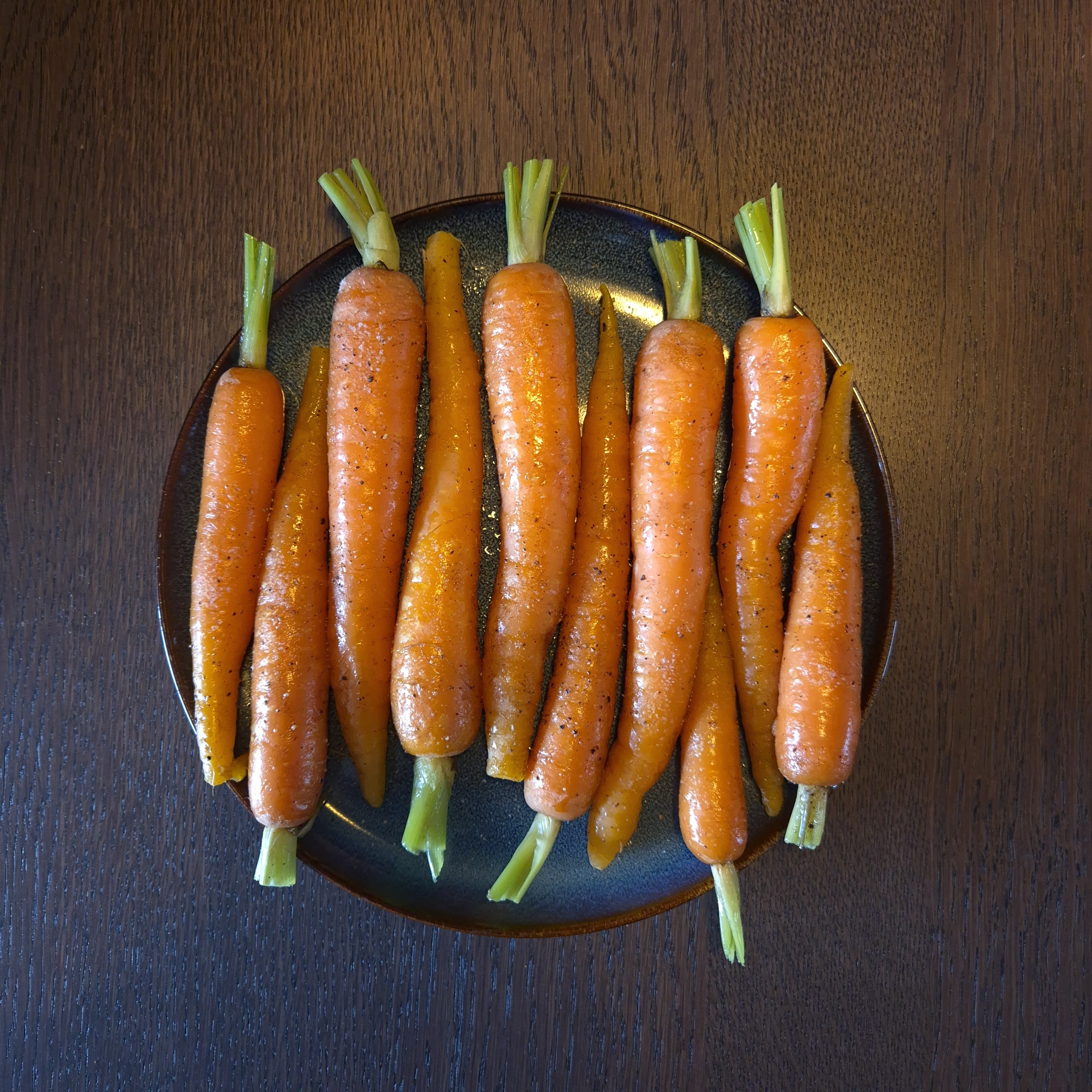
Looks like a phone snap, you want more control over the light as there appears to be two color temperatures fighting with each other.
If you’re able to get your camera locked off nicely you can build up the lighting by using multiple exposures and blending the frames in post. For example, one exposure with just the key light, then another for fill, then you can blend in selectively.
Styling wise I find it a bit perculiar - are these ready to eat? If not why are they plated up like that. It’s not quite making me want to reach in and grab some which I’d usually aim for in food photography.
Nice. I would call it mixed media/technique, rather than photography
You have two light sources of different colors.
Diffuse your light source and block ambient light. This is best achieved, in part, by increasing your shutter speed and using a strobe. Without the strobe, you should get a black image. Adding a diffused strobe would minimize specular highlights. I also find it helpful to use props (plates) that don’t reflect light as much. Speaking of props, the table looks like it’s from an office lunch room.The camera is at an awkward angle.
You’re not totally parallel with the table and the carrots aren’t perfectly perpendicular. Always nice to get it perfect in the shot but this should be fixable in post.Carrots are raw.
I’m not sure if you want to cook them, maybe just blanch them for a minute then cool in ice water so they at least look appetizing. Blanching would bring out more color too.That might seem like a lot but it’s really not. I mean, you gotta make do with what you have so ignore the comments about props. Work on composition and lighting and, if you’re shooting food, make it look edible. If you don’t have a diffuser or strobe, your first step should be blocking that ambient light. You want a large black surface facing the carrots from the bottom left. To diffuse light, you can try covering your light source with a piece of parchment or tracing paper or a white sheet.
This is actually a great submission and easy place to get started. Not too complex. Should be easily improved upon.
Edit: I will say, after looking again at the tiny thumbnail version of this, the lighting looks interesting. It almost looks painted with light. It’s not until you look at the full size photo that you can spot the inconsistencies.
Like voles and muskrats, lemmings feed mostly on plants. They eat a wide variety of plant species, and feed on grasses, shrubs, leaves, twigs, roots, fungi, and more. During the winter, instead of collecting food in their tunnels, like pika, lemmings dig beneath the snow and search for buried food. They can eat very tough plants because, like all rodents, their teeth grow constantly.
Softer light from a different direction would make this a lot more appealing.
Yes softer would be the right direction.
the specular highlight make it look like a snapshot, even though it’s a good setup. Diffusion on the key light would help.
Edit- that or the fill light needs to be brought up.
More diffusion. If you’re on a budget, get some large sections of cardboard or poster board to use as fill. The light is too harsh and brings out the imperfections. I would also reduce clarity or slightly blur the table in post, it’s too busy.
I agree with what others said about too much shiny stuff (I’d use raw carrots), and using more diffuse light. Definitely a cool composition though.
But, more importantly, I really appreciate this post because you ask “what should I change” and it created some interesting conversation!
They definitely are raw (the tops are perfectly green), but covered in oil and what looks like seasoning. It gives an AI vibe because it’s close to reality, but then you realize no one eats carrots that way.
Ah, good catch about the green tops. They might be on their way into the oven/air-fryer or something :)
Is it cake?
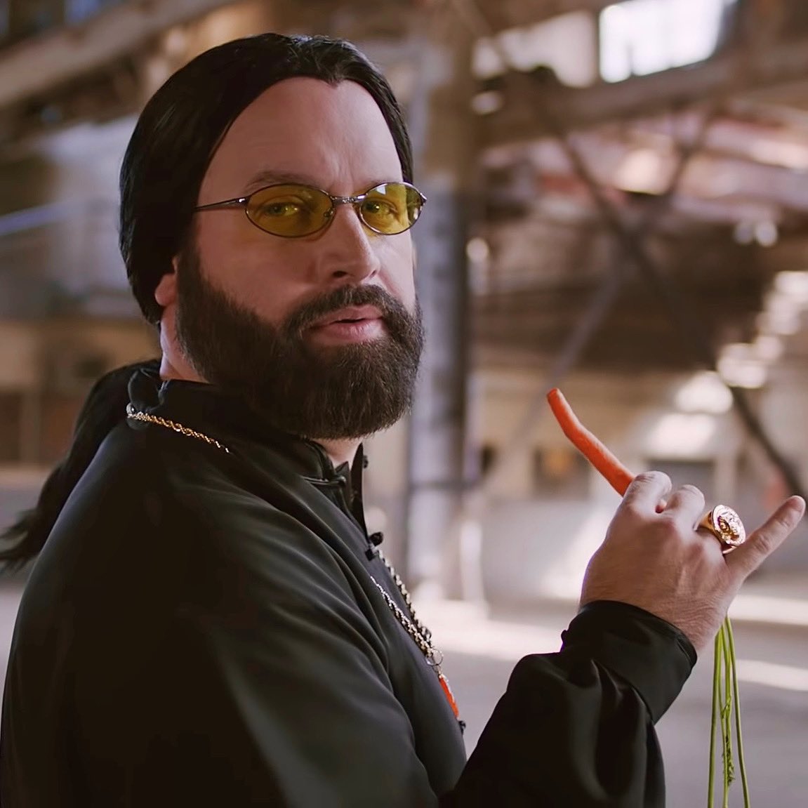
I personally dislike the mixture of natural light and artificial light, and I think I see this kind of contrast of blueish (natural) and yellowish (artificial) lighting in your picture.
Don’t know if that’s a general rule, but I have made only ugly photos with mixed light sources.
If I remember correctly it messes with the white balance, especially when set to automatic. So it always kind of looks wrong for one of the two mentioned light sources.
From a photography perspective I’m not a fan of the background. Brown pseudowood combined with that dark plate is not doing much for me. I think that you could do better with a different background that would let the carrots pop out better.
And there seems to be a hair on one carrot, which totally shouldn’t be in food photography:

i think it looks more like cracks. either way, it doesn’t look so good.
Awesome shot
What would need to be changed?
Maybe a more consistent background (table) lighting
And maybe you could use softer light, or if you are going for he bubble reflexion look oil up those carrots a bit more

