- cross-posted to:
- lemmyapps
- cross-posted to:
- lemmyapps
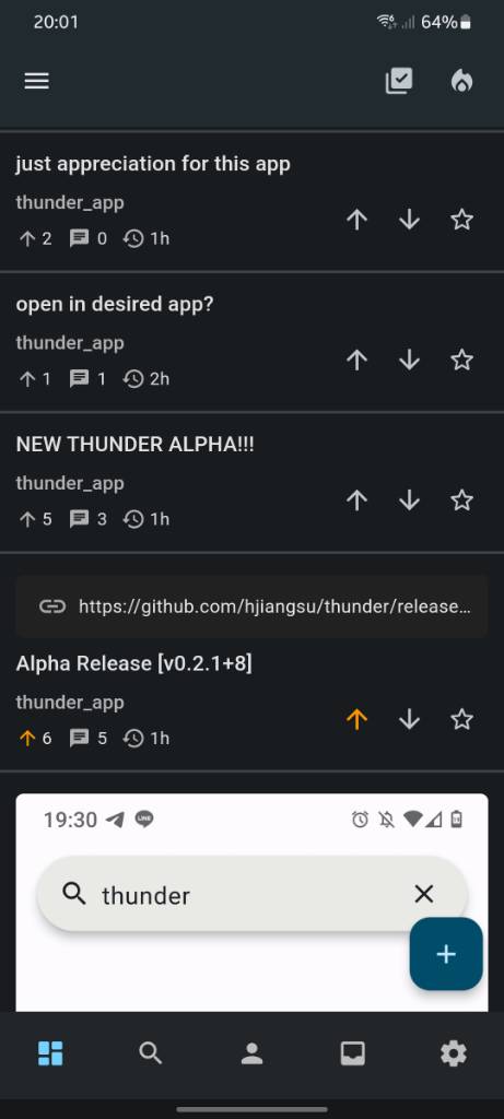
Watch out! Theres another update incoming 🎉
This release has a lot of changes under the hood which will pave the way for better performance overall, and hopefully allow for shiner features in the future! There’s a lot of quality of life changes in this one to make your experience hopefully better.
Since this release has a lot of under-the-hood changes, its expected that bugs may show up that were previously not there. Please open up a GitHub issue if you find any of those!
Obligatory message: If there are any developers out there who want to contribute to this project, that would be greatly appreciated!
To see the full details of this release, check out the GitHub release announcement: https://github.com/hjiangsu/thunder/releases/tag/v0.2.1%2B8
For those on TestFlight, the update should automatically install on your device. For those who obtained the app through IzzyOnDroid, that update should eventually reach your devices!
There is also a discussion page here for any general discussions about this release if anyone is interested: https://github.com/hjiangsu/thunder/discussions/115
I am so glad to see all the support for this so far, and it has truly been incredible. Thank you all for helping me build this app, and let’s continue to make it even better
You must log in or register to comment.
For those on Android, theres a few things I would like to get your feedback on (I don’t have a physical Android device so I cant see it for myself):
- How does the icon look like to you? Has it improved from last time?
- How is Material You? Does it work as expected?
- Did the name of the app change to Thunder instead of thunder (capital case vs lower case)?
Icon looks great, Thunder is capitalized! Material You is working beautifully, though I might consider having it theme the floating New Post button as well?
AMAZING release, dude!
The floating button does get themed for me, when material you is enabled.
- Icon’s great now! Fills the full app circle
- Material You works as expected! Colors are themed correctly
- It’s now Thunder instead of thunder
The icon changed to a full black circle with the logo in the middle as it should be and the “T” is now capitalized. I am running Android 11 so no Material You testing for me. That was adden in Android 12 and up
The icon is lit in both UI 🔥
I think Material You works nice as well.
The only thing that confuse me is the order of the swipe actions, I think here are swapped compared with every other app (some have the ability to customize this as well though).
The long term plan is to allow customizability of the swipe gestures! Not sure when I’ll be able to get around to that though
I see, thanks for the input!
The logo looks great, a bit more elegant! Thunder is capitalized and the Material You theme seems to work great, though I don’t know enough about how it’s supposed to look to say for sure. It does seem to use the right colours.
Take a look yourself at Material You 😀 Also to mention also: it loads only a few comments from this post but there are 20+
Thank you for this great app.
This could be most likely that there were new comments added since the last time the post was updated. If you refresh the feed, you should be able to see the updated number of comments!
No issue with Thunder. My instance did not show all comments. Just found out that this was the reason. Sorry for that.
The only issue I’m seeing with the material you design and actually this is kind of a problem with the dark theme is the text of links in posts is not readable. E.g https://ibb.co/qpjtNm4
Thanks for pointing that out! I’ll see if I can fix that 😅
Agree with shortwavesurfer re:logo and the Material You theme looks like how I would expect, much prefer it to the default dark theme.
You are killing it mate, well done.
- Icon looks great
- Can’t test Material You
- T is upper-case now
Can’t emphasize enough how much of an improvement this is. Amazing upgrade. Thank you !
deleted by creator
You added everything I asked for and everything else I secretly wished for! What an amazing update, you are awesome! The new icon and Material You theming are A+, thank you so much for all your work on Thunder.
Thanks! I appreciate the words!
Love the update! Default sorting options and default starting page is just what I was waiting for. I have found two regressions so far on android:
- It’s now impossible to exit the app by pressing the back button multiple times. Not a big deal, but annoying.
- The swipe gestures to upvote/downvote/reply/save no longer vibrate when swiping on comments, only on posts. I suspect I have upvoted many comments by accident while trying to scroll.
Hey, I noticed those two things as well and they should be fixed in the next release! Thanks for the feedback!
Really liking this app, a big improvement in navigation over the website. Thanks for your efforts here.
Can we get fully collapsed comment threads back as an option? Also when a comment is collapsed, there should be some indication that there are child comments hidden
Yup, that was an issue that was brought up, so I’ll add a settings option to switch between the two modes!
Also when a comment is collapsed, there should be some indication that there are child comments hidden
I agree, I just need to find a good way to visually represent that!
Cool, thanks!
It is one of the best designed lemmy app so far but my biggest issue with the app is that after scrolling a certain amount app becomes so laggy to the point it becomes unusable. Hope the issue is fixed soon.
I’m an Android user so let me know if more info is required.
Hey! Yeah, I am aware of the performance issues and it will hopefully improve in the future!
Yoooo this is the best Lemmy Android app I’ve tried by far! Will this be on the Play Store eventually?
Will this be on the Play Store eventually?
There’s a possibility for it to be on there, but not at the current moment! I want to make sure the experience is as good as possible before launching it on Play Store or the App Store :D
Don’t forget to unpin the previous release and pin this one !
Loving it so far, I’ll probably be back with more feedback after testing but so far the one change that’s weirding me out a bit is the new collapse only collapsing the parent comment. For some long comments it was very handy to collapse them and have a one line preview. Maybe a compromise with a pixel height would could work ? I just had a comment with a screenshot bigger than my screen and was sad when I clicked on it and still had to scroll the full length.
New settings are great <3 Great work !
Hey! Thanks for the quick feedback! I think for this, there’s different opinions on how it should be handled.
I think the best solution to this would be to just add in a setting which allows you to switch between the two methods of collapsing :D Feel free to open up a issue on GitHub for this!
You got it boss ;)
I would disagree with the commenter above. Collapsing all comments except for the one you click on is intuitive behaviour for me as a user of the Relay app for years, and I think this is how most Reddit apps work.
So yes I think it would be best to have a toggle setting 👍
I just downloaded the app. I love the feel, look & everything so far!
I’m such a baby at this, so please excuse my ignorance. But I can’t seem to like comments under posts. Am I just missing something?
Also I don’t know where to find my comments that I’ve made. Again, am I just so dumb I can’t find it? How do I see My posts & comments & how do I like other ppl’s comments? Please & thank you.
Sorry, I didn’t know where else to ask this. 🥺 I love this app so much rn.
Hey! Thanks for trying Thunder out :D I would like to preface this by mentioning that this is still in (what I would consider) very very early alpha. Because of this, there’s still a lot of features that I’m working hard to bring to everyone in the community!
But I can’t seem to like comments under posts.
You can perform actions on comments by swiping on them! Currently, that’s the only way to upvote/downvote, save, and reply to comments
Also I don’t know where to find my comments that I’ve made.
This is currently in the works! In the next release, I’m hoping to have a more detailed profile view where you can see your posts, comments, and hopefully saved items
I hope this answers your questions!
Oh my gosh I LOVE THAT!! The swiping is AMAZING 🤩
Yes, completely answered, thank you! I’m here for the long haul, I don’t mind.
The swiping is now my favorite thing. I love this so much. Thank you for all of you making something so cool 🥰
Loving the swipe to upvote function. Reminds me of Relay ☺️
The app feels amazing! One thing that I personally want is the possibility to share images, gif or videos as they are, not only as a link to the post…
Other than that, I’m switching from connect!
@darklightxi this app is still under development but it’s very promising.
the icon for me is a square with white background, and the loading posts is a hit or miss, but still it’s way better then all other clients I have tried in it’s current state, nice
I just installed. Very sleek looking. good job.
Looking as gorgeous as ever. Keep up the great work!
Nice! Although when I first launched it after updating, it got stuck on the (frozen) spinning loading wheel for like 20 seconds. Luckily everything is working fine now. I’m on iOS 17 by the way
Hey! yeah, theres been a lot of changes under the hood so that may have contributed the to loading that you saw.
The best thing (if I could do it) would be to ask everyone to re-install the app if possible since there may be inconsistencies due to all those changes