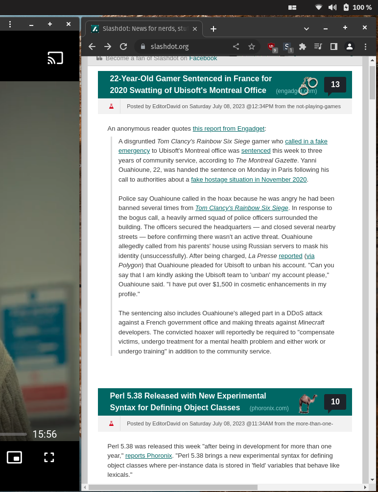
You can’t even just uBlock zap the sidebar since the feed div has a fixed right margin. StyleBot to the rescue.

Much better!
Also mildly infuriating is if you try to grudgingly load the mobile site in a desktop browser, it just redirects you back to the crappy, non-responsive desktop version.
If you found this useful, here’s the CSS overrides to use:
#slashboxes {
  display: none;
}

.main-content {
  margin-right: unset;
}


What you want for the CSS is a media query that adds conditional CSS when the window is below a certain width.
I forget the exact syntax since I’m no longer a web dev but it’s something like:
Then as you switch between half and full screen the sidebar will automatically appear or disappear without you having to change the css when you change tiling.
Yeah, I could have done that, and I do similar to what you proposed on other sites. But that sidebar is completely useless to me and has never had anything of interest, so I’m content just nuking it from orbit.