

I appreciate the graphics that they post, but this one was… Bad.
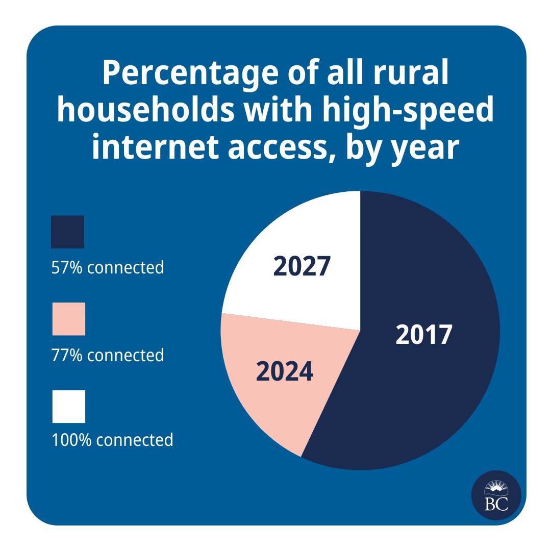
This is great news! And please also extend my deepest sympathies to whichever analyst was asked to cram this histogram into a pie chart.
They are taking the criticism in good faith though
Well, we’re taking a pie in the face on this one @[…]
We try to make info like this as clear as we can, @[…], but we don’t always get it right. Thanks for your feedback. We’re, uh, cutting ourselves a slice of humble pie.
The post: https://www.instagram.com/p/C7Pi4qAh72c/
Lol this is hilariously bad though, I can’t even figure out what the pie areas represent. Like, 2017 is about 55-60% of the pie. What fact in that set of data represents about 55-60% of something? It’s like they just dragged the pie slices around until they liked how it looked. You can’t even make graphing software give you that output.
I (somehow) figured it out. Picture it as 3 separate pie charts stacked on top of each other. Or 57% as the base amount and each subsequent area is the increase on the previous amount.
2017 = 57% 2024 = 20% 2027 = 23%
oh shit you got it.
I still don’t think they could have produced this from graphing software, it must have been drawn by hand and w h y