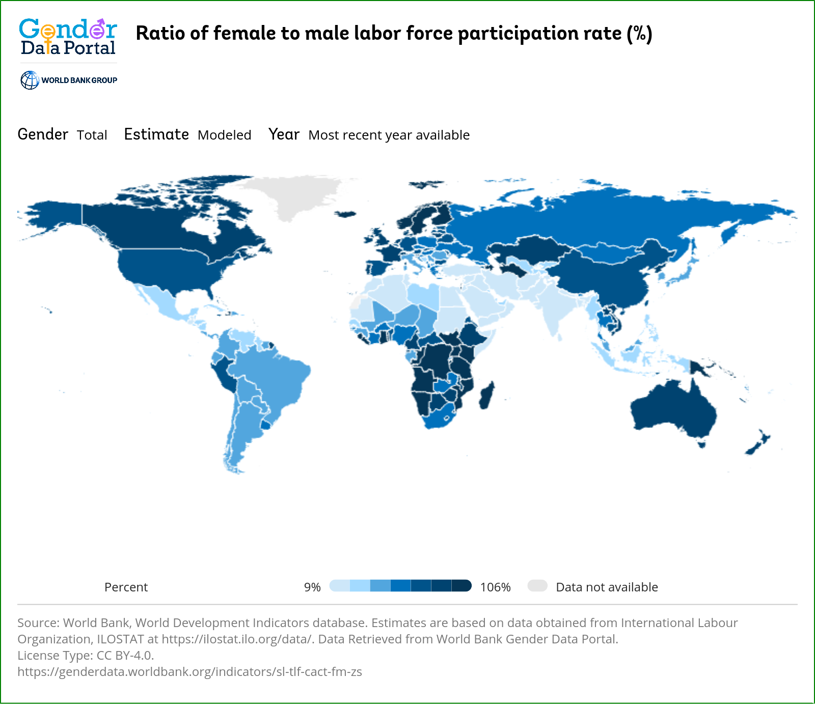
For scaling they just took the lowest participation to largest. Straight off the data with no adjusting for readability. And they divided it into seven brackets. Why seven? Whyyyyy??? It is like someone just took some data and ran it through their visualizer just to get something to their editor.

Is it just me or does the color gradient and weird scaling make this really hard to read? Like what do any of the middle colors even mean?
For scaling they just took the lowest participation to largest. Straight off the data with no adjusting for readability. And they divided it into seven brackets. Why seven? Whyyyyy??? It is like someone just took some data and ran it through their visualizer just to get something to their editor.
Not just you, was gonna ask wtf is up with that scale.