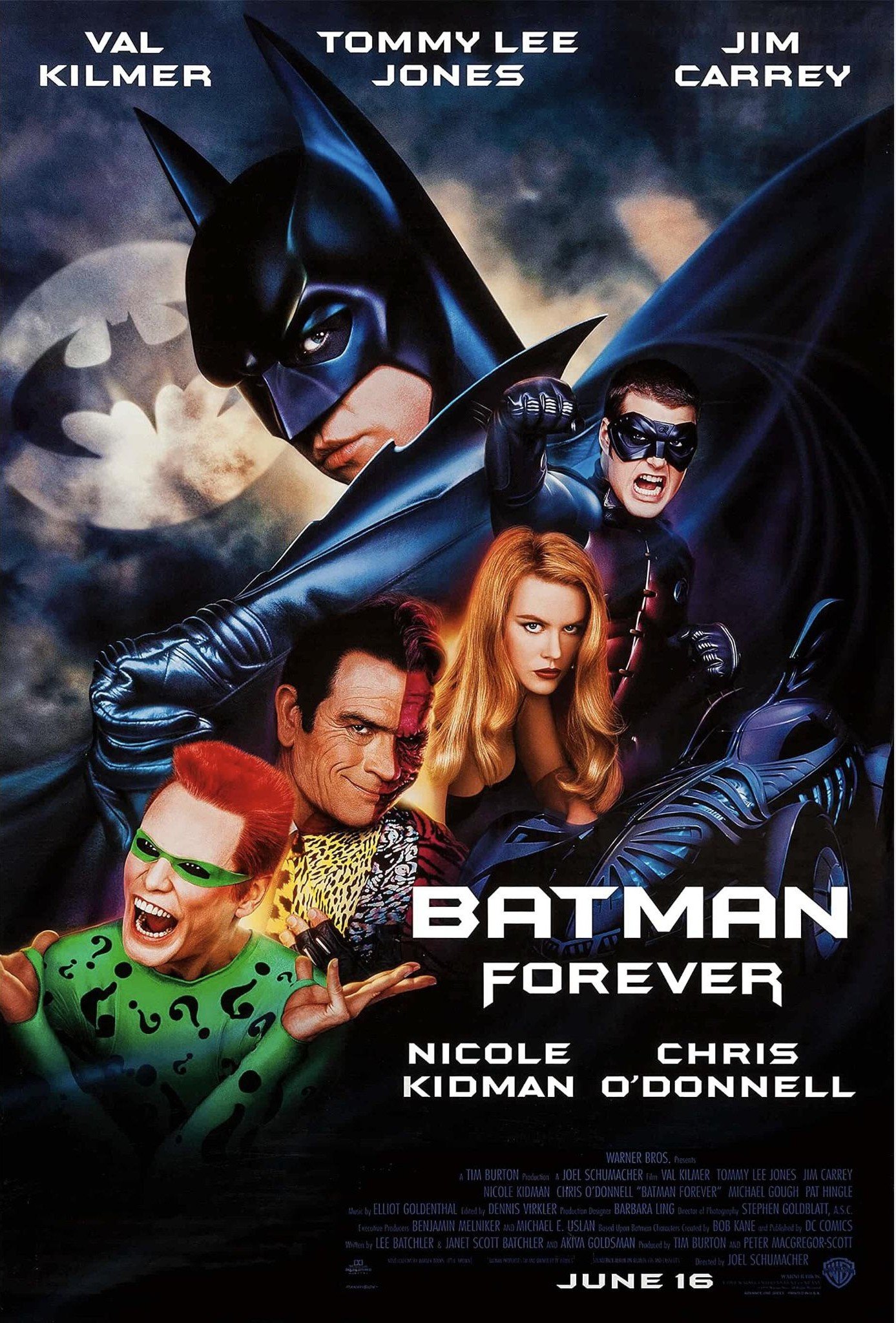
I love how vibrant all the colours are - there was something about movie promotions in the 90s that just really hit… I’ve such clear memories of this and the Casper posters lol
Yeah that scene is pretty cool in terms of aesthetics, just cringe AF with Robin like “I forgot my suit”… Lol.
But yeah absolutely, practical effects go a long way! Though once digital effects are done well it makes a big difference


Jim Carey’s expression is the best thing about that poster.
I love how vibrant all the colours are - there was something about movie promotions in the 90s that just really hit… I’ve such clear memories of this and the Casper posters lol
Not just the poster, the movie itself also wasn’t afraid to have some color. The [neon scene] (https://m.youtube.com/watch?v=MIpc-xSRbsQ) always sticks out to me.
Actually just watching that scene makes me miss the more practical effects of the older super hero movies.
Yeah that scene is pretty cool in terms of aesthetics, just cringe AF with Robin like “I forgot my suit”… Lol. But yeah absolutely, practical effects go a long way! Though once digital effects are done well it makes a big difference