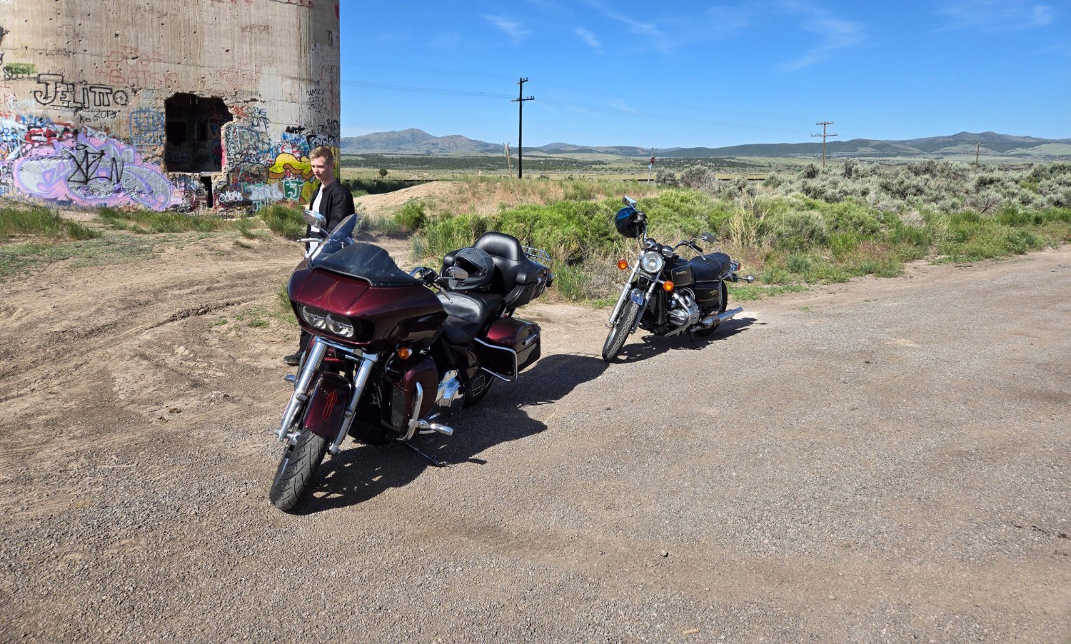
This is from a few weeks back. Getting some seat time on the GL1000. Ran into ignition issues last year, but we’ve since gotten them sorted and been putting on miles.
This was taken near Silver City, UT.
This is from a few weeks back. Getting some seat time on the GL1000. Ran into ignition issues last year, but we’ve since gotten them sorted and been putting on miles.
This was taken near Silver City, UT.
Ok I wasn’t sure before because I was on my phone and might have been missing some small detail. But I’ve just tried opening your original image and @[email protected]’s version in separate tabs and switching back and forth between them repeatedly. I cannot see any difference.
To be honest you get kind of used to seeing certain things in rural places. It honestly wasn’t the focus of the photo, but I realized that some folks get extra sensitive to things, so I went and edited the photo and updated it.
It’s the let’s go Brandon graffiti.
But what about the graffiti? I can’t see any difference between the two.
Not the stuff near the ground. Look further up for red text on the wall saying let’s go Brandon.
Yes, I know. The OP:
looks to me to be identical to @[email protected]’s version:
What am I missing?
Ops one linked to me cuts off a chunk.
Weird, mine isn’t cropped like that.