

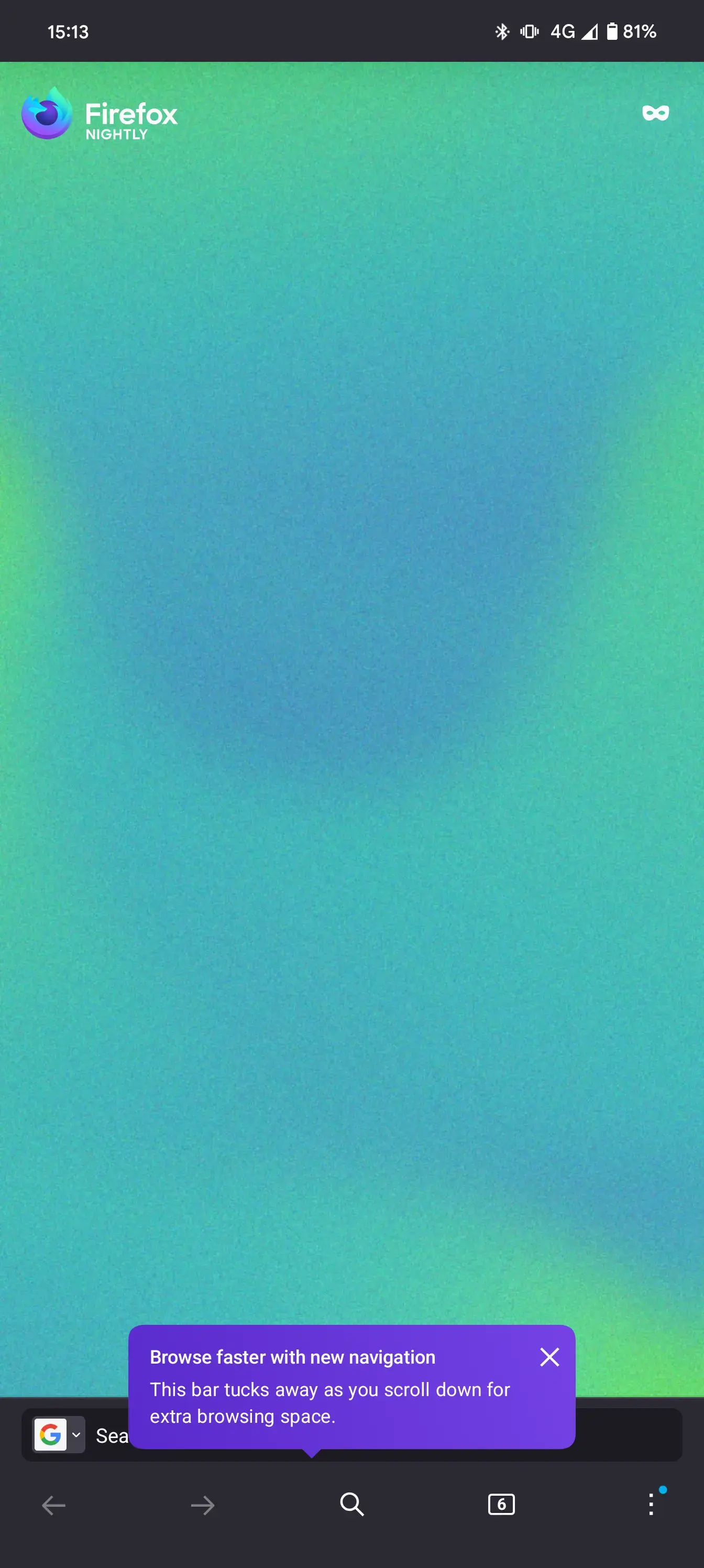
With the version 130, Mozilla introduces a new navigation bar in Firefox for Android. If you don’t like it, you can disable it in the “Secret Settings”.
I was not a fan when it popped out on my screen. But, after sometime, it’s pretty useful and saves a tap on the three dots button.
I had already seen this design a few weeks back and was then, as I am now, not very excited about it :^(
It’s possible they’re trying to address the issue of the old toolbar being too crowded, and that’s neat, but I don’t think this is the right way to go about it:
So…
It seems like they had the right intentions, but somehow chose a really weird direction to go in. I don’t like that the way to disable this is hidden in the secret settings, it doesn’t exactly give off the impression that it’ll remain an option in the long-term. I’m going to try sharing my feedback with Mozilla, hopefully it’ll be useful.
P.S. it’s far from all bad. I’m actually really interested in the new three-dot menu design, and there’s a lot I could write on why. It’s just that the toolbar is the most used and seen part of the browser; is it really asking for much to have it be closer to my ideal instead of an abstract generic user’s?
P.P.S. upon further thought, large parts of this comment are just plain silly. Come on, I trust they’ll add a toggle as the feature leaves nightly, it’s clearly not ready yet. This is what happens when you forget nightly is for testing, you make a fool of yourself on lemmy. Some concerns remain (e.g. tab grouping), but again, that’s what constructive feedback is for. I’ve already seen multiple people very happy about the navbar, to the point that I almost feel bad for not liking it, ha
I agree with you entirely on this.
Got used to the new bar quickly, however, I absolutely dislike that they hide parts of the URL/domain.
Didn’t find any related config in about:config or secret settings.
With this in place, I’m probably going to continue using the old navigation bar.
I don’t know if that’s the final design, nor if they plan to make it universal (applies on both new and old design) later on. Probably worth looking into, I’m not a fan and would rather be able to use any design with the full URL.