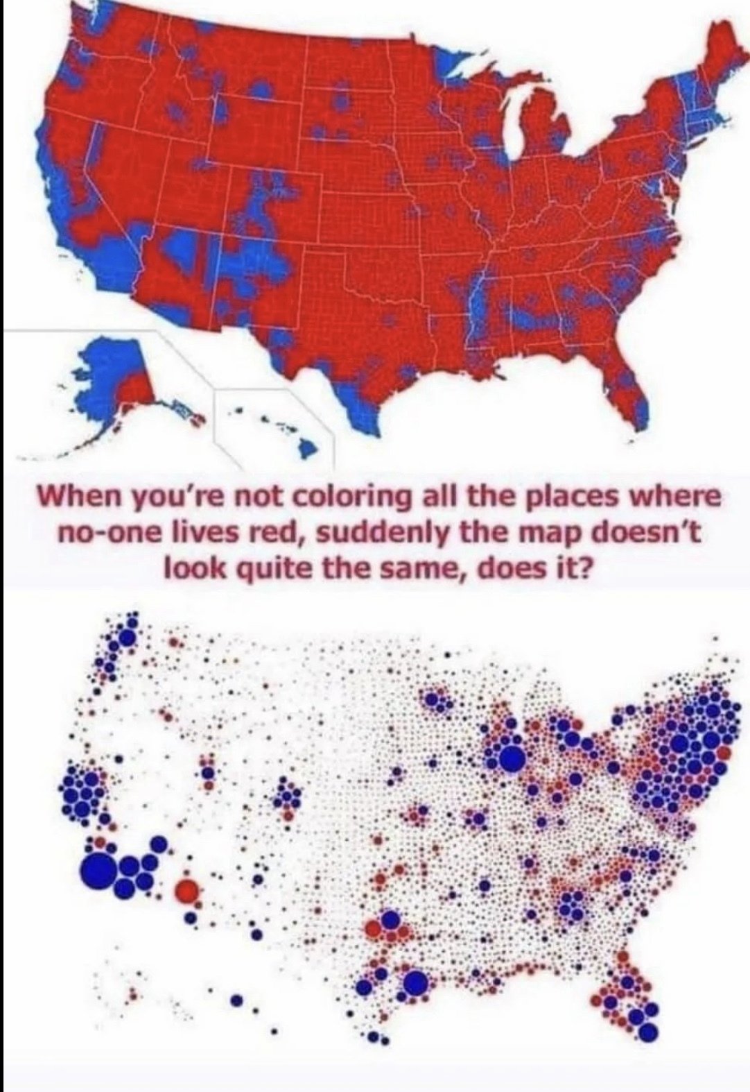
The dots are counties - the largest red one above LA is Kern county - Tulare county is the smaller red dot above it to the right
This is a clearer version of that map. The other two much smaller red dots above LA are Kings and Inyo counties - this map is based on 2016 presidential results, as Inyo went blue in 2020 (by only 14 votes though)
Yeah and that’s only because they lean that way by slim majorities. There’s still mid 40s percent democrat affiliation here in both counties. I’d like to see a version of this map that shows the purple continuum. That would reveal even more.