
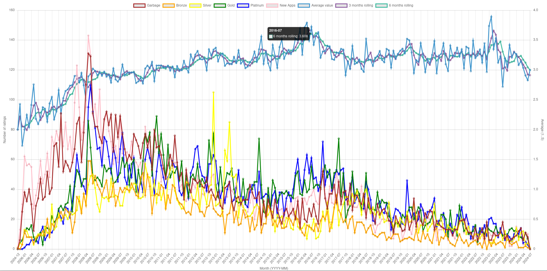
I took each rating for games on Wine Application Database, mapped them to numbers (Garbage -> 1, Bronze -> 2, Silver -> 3, Gold -> 4, Platinum -> 5) and plotted a monthly average.
I took each rating for games on Wine Application Database, mapped them to numbers (Garbage -> 1, Bronze -> 2, Silver -> 3, Gold -> 4, Platinum -> 5) and plotted a monthly average.
The left axis is average number of ratings per app. As all rating except the 3 month, 6 month etc lines have dropped then to me this suggests there has been an explosion in the number of apps in the database.
The more apps, means more smaller apps with frwer user ratings so the lower the average number of ratings per app overall would be?
The left axis is total number of ratings of each type (Garbage, Bronze, Silver, Gold, Platinum) in a given month (not per app). For example for month
2016-07there were"Garbage" => 22 "Bronze" => 14 "Silver" => 13 "Gold" => 55 "Platinum" => 61On right side is the average rating. So if I assign values to each rating:
  "Garbage" => 1
  "Bronze" => 2
  "Silver" => 3
  "Gold" => 4
  "Platinum" => 5
I can get an average rating, which will be between 1 to 5.
((22*1) + (14*2) + (13*3) + (55*4) + (61*5)) / (22 + 14 + 13 + 55 + 61)
 ~=  3.721