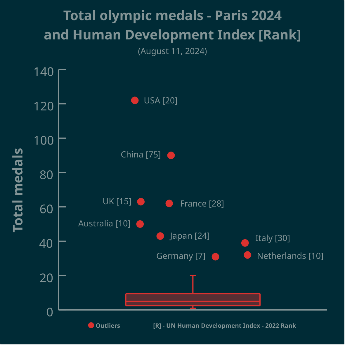
▶️ Total olympic medals won in Paris 2024 and Human Development Index 🏅
➡️ https://www.businesstimes.com.sg/opinion-features/what-olympic-medal-table-really-tells-us
After reading the article we made this #boxplot using #LabPlot, an open source data analysis and visualization software.
The plot doesn’t provide answers, it rather invites some thinking.
#Olympics #Olympics2024 #France #China #USA #UnitedStates #UnitedKingdom #UK #Brazil #Australia #Japan #Italy #Canada #Germany #Italy #Netherlands #DataAnalysis #DataScience #OpenSource #FOSS
“doesn’t provides answers but invites thinking”… Nope. Doesn’t even help that as the X-Axis is unlabelled
@clutchtwopointzero
A boxplot is a 1-dimensional plot. The data points are jittered along the x-axis to make them less crowded.
More on boxplots here:
➡️ https://labplot.kde.org/2021/08/11/box-plot/
➡️ https://userbase.kde.org/LabPlot/2DPlotting/BoxPlot
Yeah, not a good way to visualize as the relationship between medal count and HDI is not obvious as only outliers get highlighted and the lack of information on other countries actually invite doubt as to the story that the plot is trying to tell (for example, Singapore and Hong Kong have extremely high HDI but the sheer smallness of their population is a factor against a higher medal count). There’s nothing wrong with a traditional 2D scatter plot and axis-related box plots plotted against each axis separately
This viz is shit because nobody can understand it.
1 dimensional visualizations are fucking stupid. The whole point of data viz is to simplify complex information; not make simple info complex.