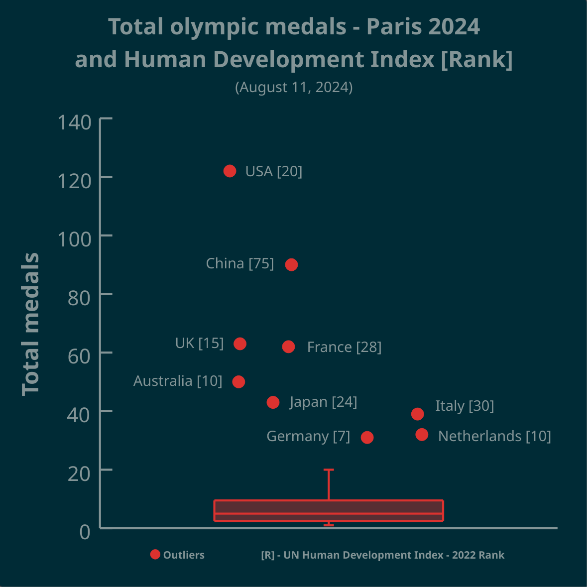
▶️ Total olympic medals won in Paris 2024 and Human Development Index 🏅
➡️ https://www.businesstimes.com.sg/opinion-features/what-olympic-medal-table-really-tells-us
After reading the article we made this #boxplot using #LabPlot, an open source data analysis and visualization software.
The plot doesn’t provide answers, it rather invites some thinking.
#Olympics #Olympics2024 #France #China #USA #UnitedStates #UnitedKingdom #UK #Brazil #Australia #Japan #Italy #Canada #Germany #Italy #Netherlands #DataAnalysis #DataScience #OpenSource #FOSS
A boxplot is a visualization tool to quickly get an idea of how the data is distributed. In this population the outliers are so large that the info the real box + whiskers give is very low.
In your title you suggest investigating a relationship between total Olympic medals and HDI - why not choose a scatter plot here?
That the number in square brackets refers to the HDI rank only get’s clear on the second look.
The outliers being distributed over the X-Axis is confusing.
Sorry but this visualization is not beautiful, rather the wrong method used that cannot display the hypothesis stated in the title.
The choice of only highlighting the HDI of the outliers makes one wonder what the rest of the data is hiding and whether this graph is hiding the truth from the data to tell a biased narrative.
Also, box plots only work on a single dimension.