
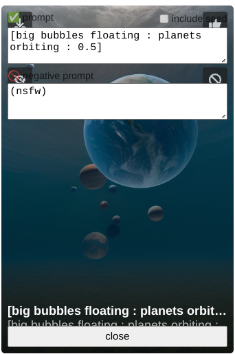
It no longer covers the image etc. Clicking on the title/description shows the info. These aren’t inherently bad things, but the way it’s currently done with icons and text and images all overlapping each other it’s confusing to even look at, let alone read the field names. Maybe at least blur and lighten what’s behind, perhaps drop-shadows beneath the text, etc. to improve readability.
(This could be in the middle of an adjustment anyway, which is fair enough.)
Cool, that’s working now 👍