cross-posted from: https://lemmy.dbzer0.com/post/27579423
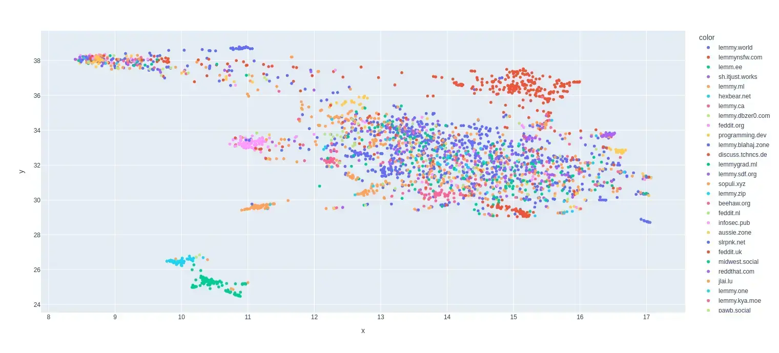
This is my first try at creating a map of lemmy. I based it on the overlap of commentors that visited certain communities.
I only used communities that were on the top 35 active instances for the past month and limited the comments to go back to a maximum of August 1 2024 (sometimes shorter if I got an invalid response.)
I scaled it so it was based on percentage of comments made by a commentor in that community.
Here is the code for the crawler and data that was used to make the map:


If I can figure that out I would definitely do that.
Anti Commercial-AI license (CC BY-NC-SA 4.0)
as a followup to how useful your visualization is, I have started spreading comments across a wider selection of instance communities.
this is something I have considered before, but your visulazation made the possible utility and usefulness of doing so much more “real”.