
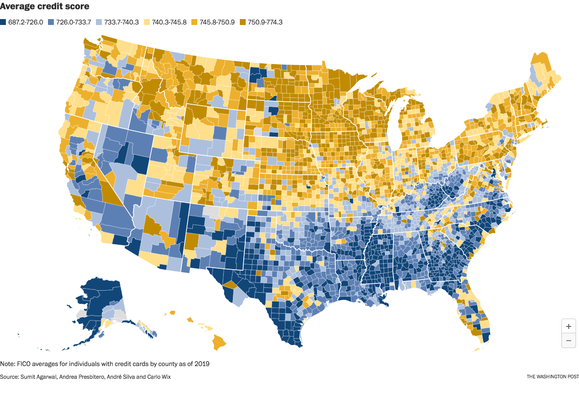
The image is from a Washington Post article which took the data from an interesting research paper titled Who Pays For Your Rewards? Redistribution in the Credit Card Market.
The research paper is a good read. (A free PDF of the whole paper is available at the link.) It examines how the use of rewards credit cards results in a massive wealth transfer from low-credit-score customers to high-credit-score customers:
We estimate an aggregate annual redistribution of $15 billion from less to more educated, poorer to richer, and high to low minority areas, widening existing disparities.
The Washington Post article attempts to frame the clear north-south split as a result of healthcare issues in the south. That explanation seems too narrow to me. This map looks too similar to maps of poverty and education, and we know health correlates strongly with both of those issues.
Edit to fix a sentence fragment. Sorry; it was late and I was tired.
Pretty much a map of poverty levels and areas where minorities are concentrated, not surprising.
How do you explain Minnesota then?
First you have to purify yourself in the waters of Lake Minnetonka
Reasonably prosperous and not a lot of minorities?