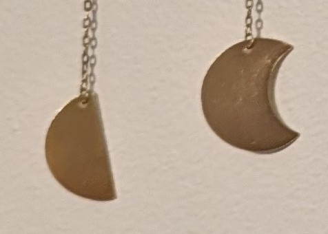
Looks innocuous enough at first glance right? Let’s zoom in on the problem:

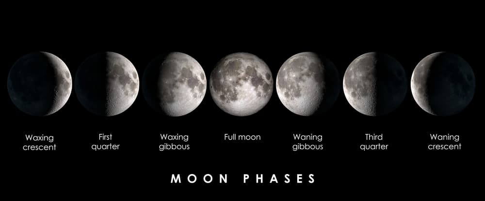
These don’t go together. If the semicircle on the left is correct, then this is showing moon phases, and the symbol on the right should be of a gibbous moon:

If the cookie-with-a-bite-taken-out in the right is correct, then this is showing an eclipse, and the symbol on the left should be of a 50% partial eclipse:

It drives me crazy every time I look at it.


As I’m reading this I’m sitting in my bathroom staring at the shower curtain my wife picked out which has an equally infuriating moon illustration…
Why on earth would they add a drop shadow while also having a semi white background? I want to find the original designer and squeeze a tube of super glue up their nostrils