

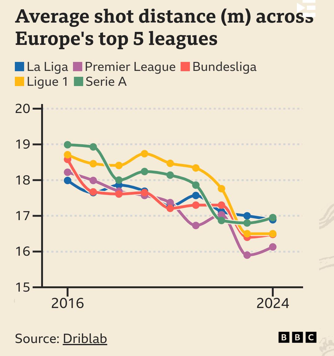
Pictured in this graph: what xG does to a motherfucker.
I thought this graph was super interesting as it is a near-perfect illustration of when data analytics and advanced statistics started to enter into football (2014-2016) and some of the effects it’s had on the game.
EDIT: Forgot to paste a link to the complete article.
This, I’d be so interested to see average goal distance plotted on the same axes.
The original article didn’t have that plotted, but I don’t see why it wouldn’t follow this line fairly closely.
I’d be more interested to see a graph of the proportion of outside-of-the-box shots scored over the years. Has it gone up, because people are only taking good long distance shots now and fewer random potshots? Or had it gone down because good players mostly know to avoid them and bad players are bad at scoring them?
Well my logic is that long shoots were always low xG attempts so even when players were attempting more long shots, the goals were originating mostly from shots inside the box. Since it is only long shots that have decreased in number, I expect the average distance of a shot resulting in a goal to hardly see any decrease
The article does show that the proportion of goals scored from outside the box has decreased, so the average distance will have decreased. It is true, however, that this line is somewhat flatter than just the shot graph, meaning some amount of the distance shots that have disappeared were impossible potshots that would never have been goals anyway.
This is another article on the subject, but only focused on the Premier League. It shows that while average shot distance has decreased, conversion rate and goals per game has increased.
So my suspicion that the ‘efficiency’ of shots has gone up with the introduction of data analysis seems to be true. I just hope that we don’t completely lose worldies from outside the box in a decade or two
I don’t think they’ll completely disappear, but that will probably be more down to most players being bad at making optimal decisions all the time than anything else.