The Picard Maneuver to Map [email protected] • 3 months agoWorld map showing whether countries have more males or femalesimagemessage-square47arrow-up1188arrow-down13
arrow-up1185arrow-down1imageWorld map showing whether countries have more males or femalesThe Picard Maneuver to Map [email protected] • 3 months agomessage-square47
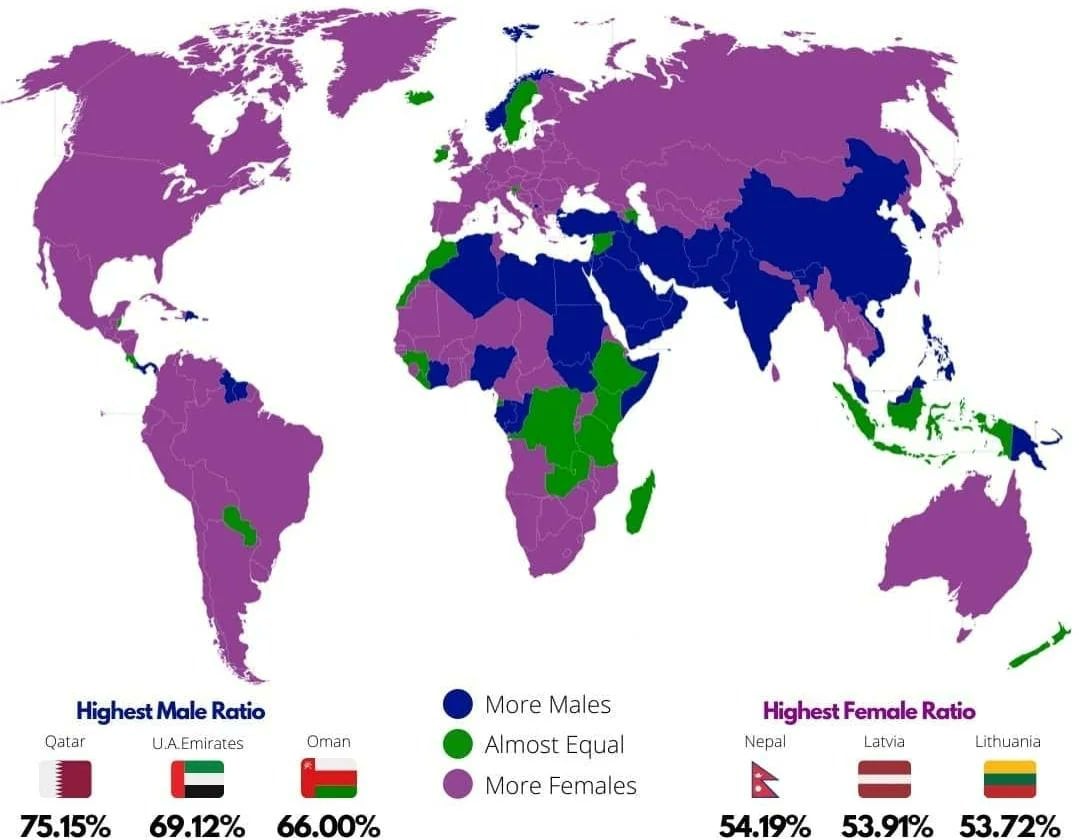
minus-square@[email protected]linkfedilinkEnglish-2•3 months agoI’m guessing the pink ones are the countries that are the most at war with other countries. Or the blue ones are the ones that recently got out of war and are experiencing the Returning Soldier Effect
minus-squareSybilVanelinkfedilink7•3 months agoLife expectancy is longer for women, so I think it’s just countries with nothing weird going on, but they’ll still have significantly more older women than older men.


I’m guessing the pink ones are the countries that are the most at war with other countries.
Or the blue ones are the ones that recently got out of war and are experiencing the Returning Soldier Effect
Life expectancy is longer for women, so I think it’s just countries with nothing weird going on, but they’ll still have significantly more older women than older men.