The Picard Maneuver to Map [email protected] • 2 months agoSuicide Rates by County (USA)imagemessage-square38arrow-up1178arrow-down122
arrow-up1156arrow-down1imageSuicide Rates by County (USA)The Picard Maneuver to Map [email protected] • 2 months agomessage-square38
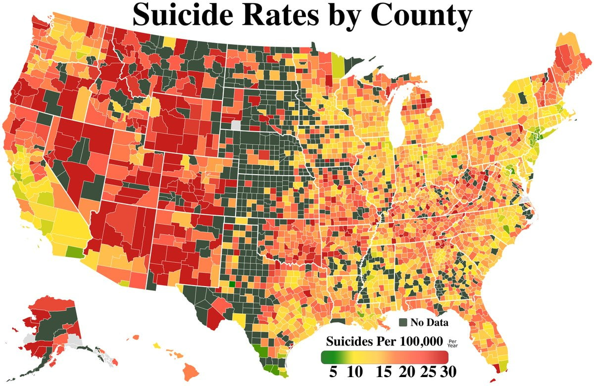
minus-square@[email protected]linkfedilink134•2 months agoWhy did they make the “no data” color nearly identical to the low value of the range? And yet there are still counties marked grey, which is what they should have picked for missing data.
minus-squarerhythmisaprancerlinkfedilink29•2 months agoI am curious about the source for this. Very strange and unhelpful.
minus-square@OldChicoAlelink22•2 months agoI’m colorblind and the low end and high end look exactly the same to me .


Why did they make the “no data” color nearly identical to the low value of the range? And yet there are still counties marked grey, which is what they should have picked for missing data.
I am curious about the source for this. Very strange and unhelpful.
I’m colorblind and the low end and high end look exactly the same to me .