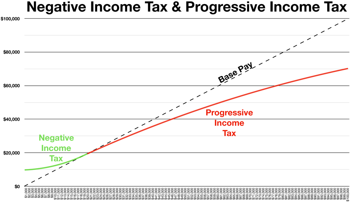
That graph plots gross pay (x-axis) against take-home cash (y-axis). The far left of the graph (in green) shows people making under 20k taking home more than their “earned” pay. At the extreme bottom is somebody making 1,000/year taking home 10,000. The progressive income tax starts at 20,000.
Not labeling the axises does make it hard to read.


What a bad set of graphs! The first one is just wrong.
In what way?
The tax is never negative. Instead, it plots a progressive tax rate, and calls it “negative”.
The second graph is just confusing and detracts from the explanation instead of adding to it.
That graph plots gross pay (x-axis) against take-home cash (y-axis). The far left of the graph (in green) shows people making under 20k taking home more than their “earned” pay. At the extreme bottom is somebody making 1,000/year taking home 10,000. The progressive income tax starts at 20,000.
Not labeling the axises does make it hard to read.
Oh, that’s right. Yes, the graph is only bad and not wrong.
Good thing it’s a wiki!