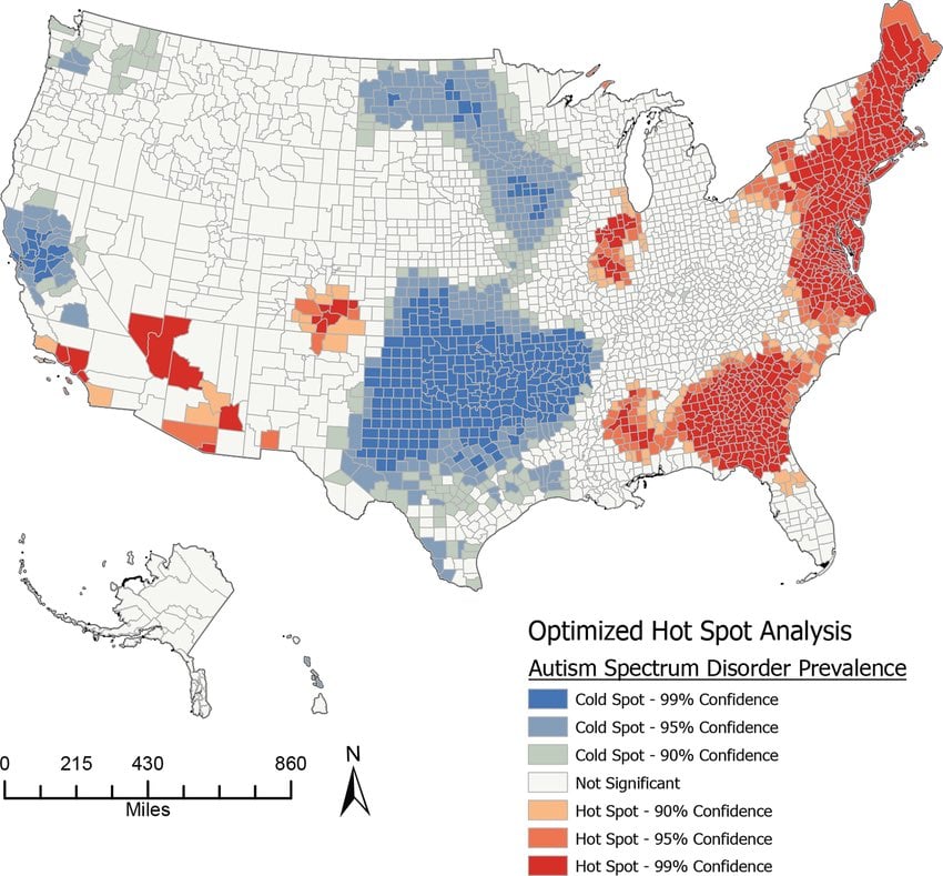
The Picard Maneuver to Map [email protected] • 2 months ago"Hot spot" map of prevalence of autism spectrum disorder by countyimagemessage-square44arrow-up192arrow-down115file-text
arrow-up177arrow-down1image"Hot spot" map of prevalence of autism spectrum disorder by countyThe Picard Maneuver to Map [email protected] • 2 months agomessage-square44file-text
https://www.researchgate.net/figure/Hot-Spot-Analysis-for-the-Estimated-Proportion-of-Children-with-ASD-County-Level_fig2_370523386
minus-square@gruelinkEnglish3•2 months agoNow I want to see a line graph of left handedness and LGBTQ over time.
minus-squareTrailblazing Braille Taserlinkfedilink5•2 months agoThe graph looks something like this: /
minus-square@gruelinkEnglish1•2 months agoNo, I mean two lines showing the change in each over time, not the correlation between each other.
minus-square@[email protected]linkfedilinkEnglish3•2 months agoI can draw you one, but it would just come out as a pen smudge 😔


Now I want to see a line graph of left handedness and LGBTQ over time.
The graph looks something like this: /
No, I mean two lines showing the change in each over time, not the correlation between each other.
I can draw you one, but it would just come out as a pen smudge 😔