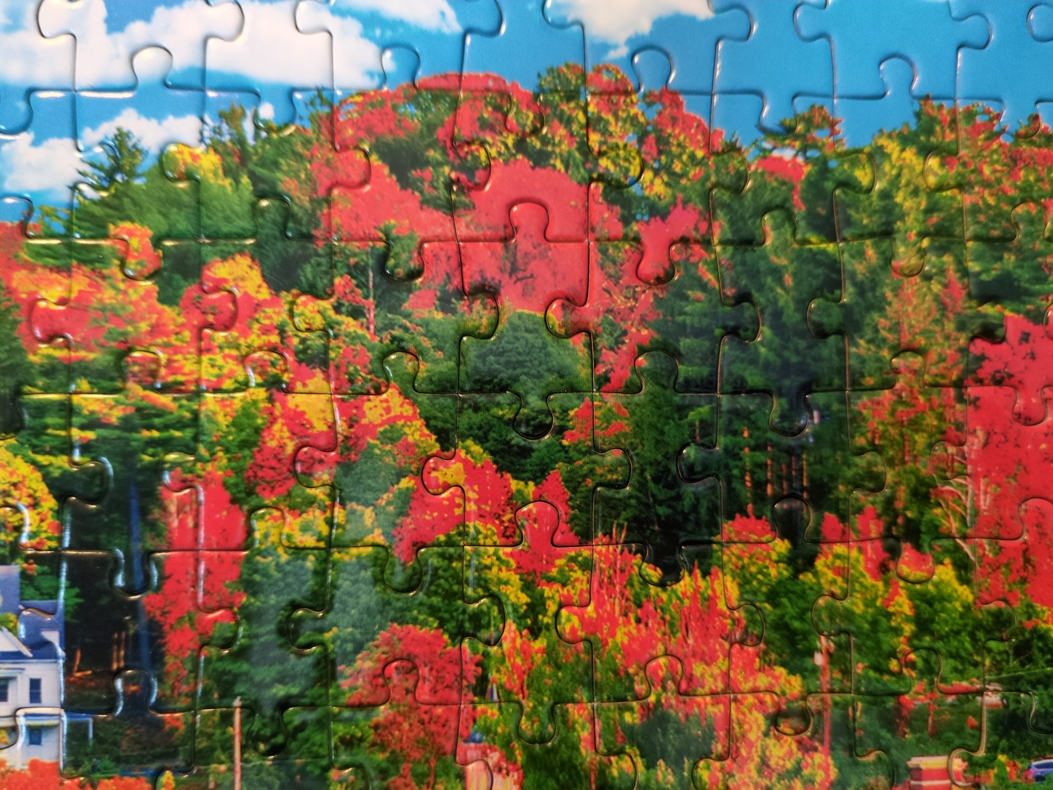

I saw this post here a while back and was inspired to pick up the Kodak version of the puzzle for myself.
As pointed out in the previous post, the image in the two puzzles appears to be the same, but the Kodak version has a few differences. The main difference is the different crop. The Kodak version has the church centered.
Another difference is the change in the sky. The newer version has a fake Blu sky with clouds applied over the original.
The difference I find the most bizarre, though, is the color tone differences. The colors in the puzzle in the older post are a much more accurate representation of reality, while the colors in the newer version have the contrast turned up so high that the red looks radioactive. Unfortunately my camera doesn’t capture them it well, but the leaves look like the heat vision from the movie The Predator. Hilariously, Kodak advertises “richer, truer colors!” on the box.


The colours are pumped to the degree it looks like a stylised painting. Very unrealistic, but kinda nice in its own way.
Because it looks so stylised though, it has a very old-timey feel, which is then strangely incongruous when you see the modern(-ish) cars on the streets.