
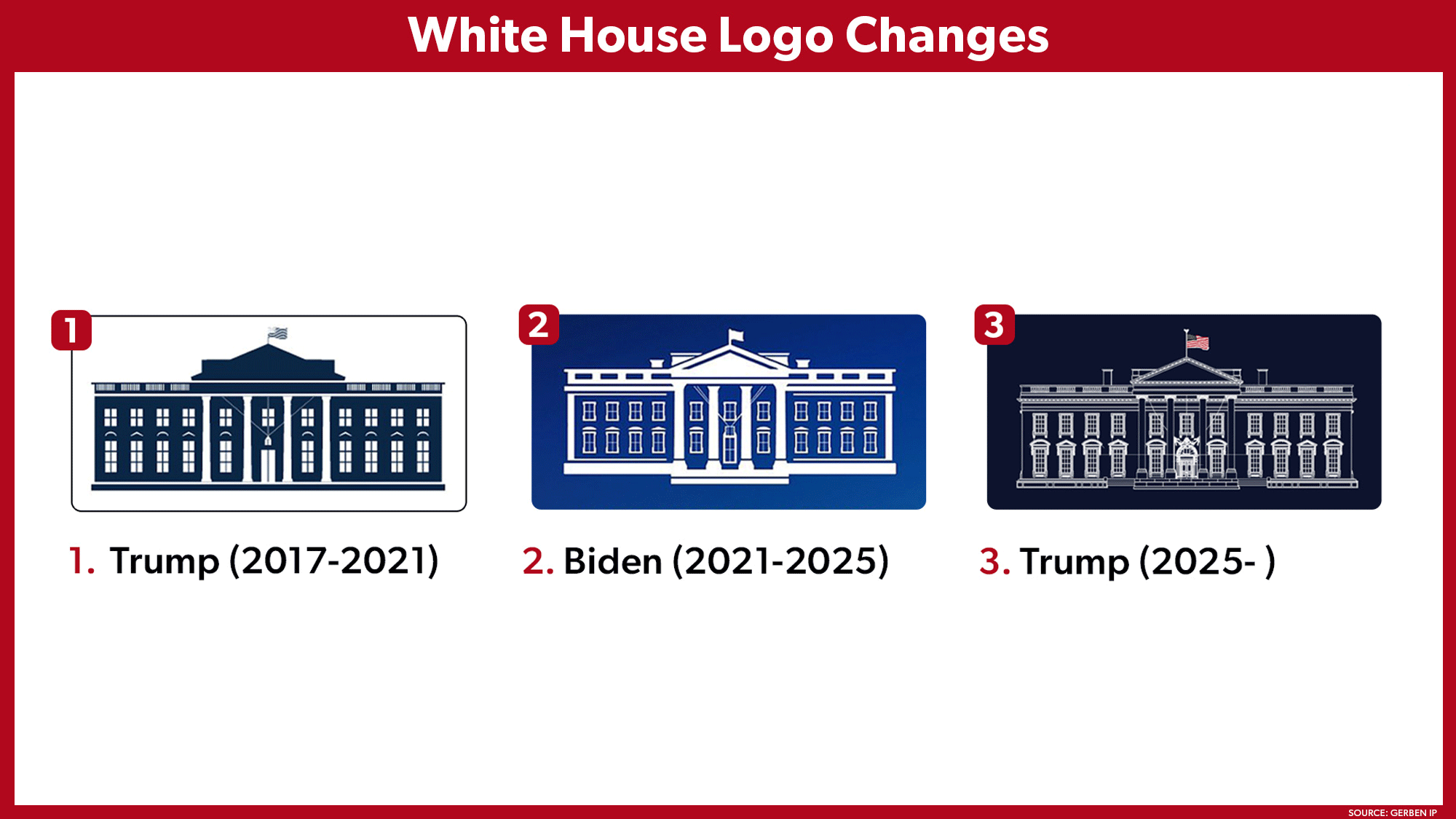
With each Presidential cycle, the White House adopts a new drawing of, well, the White House to use on whitehouse.gov and on all official communications.
With each Presidential cycle, the White House adopts a new drawing of, well, the White House to use on whitehouse.gov and on all official communications.
As a logo the new one seems much worse from a functional perspective than the previous two.
It has much more and finer details, which I assume will be harder to replicate when printed and look worse the smaller it is. And it’s the only one that includes multiple colours with the American flag on top, rather than being two toned.
Personally I like Bidens the best out of those three. The first is ok, but the flag looks really weird and again the finer details of the railing on top don’t work for a logo.
The inverted light/dark areas and monochrome color of the left logo’s flag remind me of the sovereign citizen and “no quarter” flags that right-wing nuts like to fly.