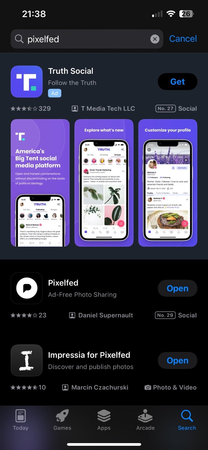
IANAL but I reckon there’s enough similarity for Polyend to consider chatting to their legal team. The Pixelfed logo is also actually (inverse) black on the apps, similar to the point where they’re just about the same if you squint.
Yeah no doubt. If I were Dan though, I’d just change it before it got to that point. Pixelfed has only actually had this redesigned logo for a few months, and the app has only just been pushed out of beta, so it’s not like it’s an established recognisable brand to lose.

Eh, it’s different enough and they’re in different markets anyway. Theirs is rounded at the bottom but Pixelfed’s is straight.
Not the way I use it
IANAL but I reckon there’s enough similarity for Polyend to consider chatting to their legal team. The Pixelfed logo is also actually (inverse) black on the apps, similar to the point where they’re just about the same if you squint.
Removed by mod
Yeah no doubt. If I were Dan though, I’d just change it before it got to that point. Pixelfed has only actually had this redesigned logo for a few months, and the app has only just been pushed out of beta, so it’s not like it’s an established recognisable brand to lose.
I really don’t think it would be an issue.
Edit: how many people know polyend?