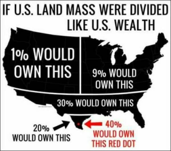
Perhaps you missed this: the meme says “if U.S. land mass were divided like U.S. wealth.” It’s a simile; it doesn’t mean that this really is the actual ratio that U.S. land is divided.
What? It does not imply that at all? Let me guess, you also think that the 1% own the entire northwestern corner of the country? And 40% of people live in a single city in Texas?
Edit: I’m sorry, this was unnecessarily rude and unnecessary in general.
I agree with you that if the meme were to accurately show the amount of land the 1% owns, then the meme would probably show that almost all of the land is owned by the 1%. (I don’t know the actual percentage.) But it says if it were divided like U.S. wealth, so it ironically shows the 1% owning only about 40%. It’s accurate to the amount of wealth that they own, not land.
Think of it like a pie chart showing wealth, but instead of a circle it’s (rather misleadingly) shaped like the continental U.S.
It’s all misleading. None of it is proportional, whether presented as a pie chart or a map.
The diagram, however you want to observe it, literally says 100% of the land is owned, by different regions and classes. Which is obviously a bold faced lie, only a small percentage of people oligarchs actually own the land, they just rent it out to the rest of the people.
And if you’re lucky enough to ‘own’ your land, you don’t really own it, you still gotta pay taxes on your dirt…
So your objection is to the verb ‘own’. Would you agree with the meme if it were to say “1% would rent this, 9% would rent this, 30% would rent this,” etc.?

The meme has nothing to do with land ownership, it’s giving a visual example of wealth differential by diving a map of the US into sections.
The meme literally says own in every section.
How else is anyone supposed to interpret the words presented to them?
Perhaps you missed this: the meme says “if U.S. land mass were divided like U.S. wealth.” It’s a simile; it doesn’t mean that this really is the actual ratio that U.S. land is divided.
I missed absolutely nothing. I read the exact words on the meme, which imply 100% of people own land.
Get real, 1% own property, while the other 99% have to rent it from the rich oligarchs and other rich fucks.
What? It does not imply that at all?
Let me guess, you also think that the 1% own the entire northwestern corner of the country? And 40% of people live in a single city in Texas?Edit: I’m sorry, this was unnecessarily rude and unnecessary in general.
I agree with you that if the meme were to accurately show the amount of land the 1% owns, then the meme would probably show that almost all of the land is owned by the 1%. (I don’t know the actual percentage.) But it says if it were divided like U.S. wealth, so it ironically shows the 1% owning only about 40%. It’s accurate to the amount of wealth that they own, not land.
Think of it like a pie chart showing wealth, but instead of a circle it’s (rather misleadingly) shaped like the continental U.S.
It’s all misleading. None of it is proportional, whether presented as a pie chart or a map.
The diagram, however you want to observe it, literally says 100% of the land is owned, by different regions and classes. Which is obviously a bold faced lie, only a small percentage of
peopleoligarchs actually own the land, they just rent it out to the rest of the people.And if you’re lucky enough to ‘own’ your land, you don’t really own it, you still gotta pay taxes on your dirt…
So your objection is to the verb ‘own’. Would you agree with the meme if it were to say “1% would rent this, 9% would rent this, 30% would rent this,” etc.?
That sort of diagram would indeed better reflect the state of affairs regarding the dirts everyone lives on…