
After seeing something similar elsewhere I decided to give this a go.
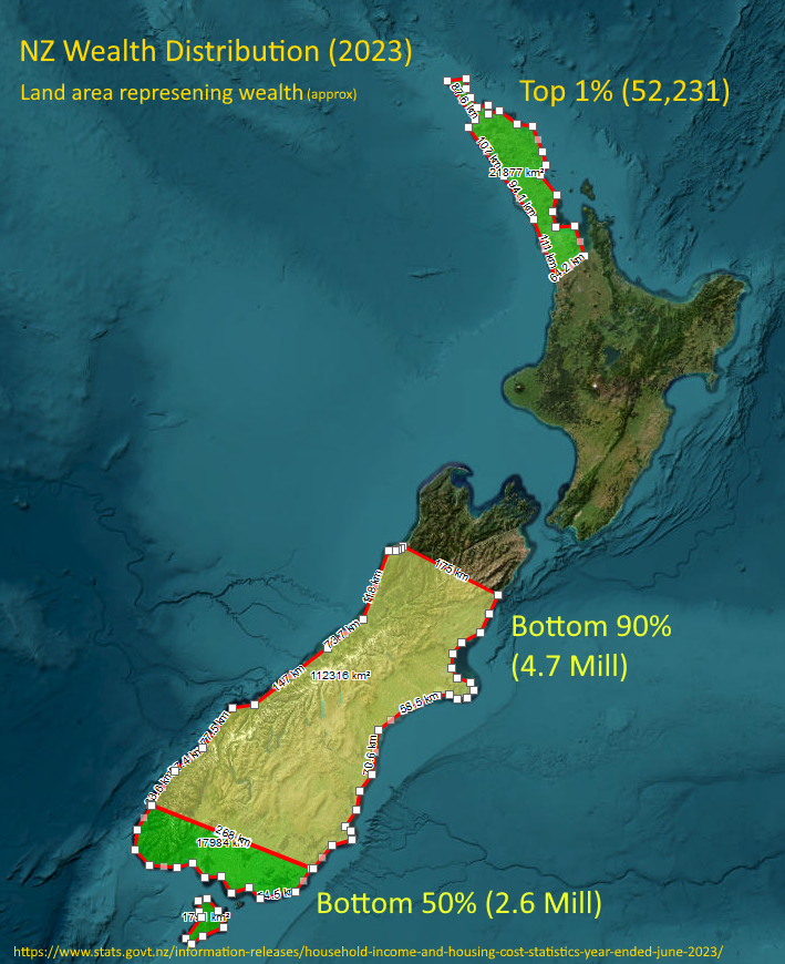
Honestly, I thought the top 1% (population the size of Hastings) might reach down to Whangarei or at most upper-upper Auckland, but it’s the visual representation of the top 10% - basically everything north of about Kaikoura - that shocked me the most!
This doesn’t look like. If the top 1% is only 52 thousand people and the bottom 90% is 5.4 million people the areas don’t look right.
The areas don’t reflect the population, it reflects the wealth of that percentage of the population. Using the map is just so fun way to represent the values.
So, bottom of the south is the total wealth of the bottom 50% of the population (2.6m). From Kaikoura north is the wealth of the top 10% with the Auckland/Northland representing just the 1% (around 52k people) who own about the same as the bottom 50%
I get what you are trying to do but it still doesn’t look right to my eyes. Maybe you should have just stuck to bar graphs.