I always wonder what the actual statistical significance of these maps are. They always seem random, and it’d make sense if it’s essentially the same mix of a little of everything everywhere.
I believe the main purpose of releasing them is to generate publicity for their company that they might not be able to get otherwise in more mainstream media. Much like how the legal brothels in Nevada put out press releases about how they’re offering free services to first responders who helped on a recent disaster or something like that. It gets people talking about them and spreads awareness about their offerings.
Much like how the legal brothels in Nevada put out press releases about how they’re offering free services to first responders who helped on a recent disaster or something like that.
Interesting, I hadn’t heard of that. But yes, they aren’t academics and don’t need their data to actually say anything.
“More often” could be by one search in a total set of 1,000,000, which basically is never going to be statistically significant - it could just be random chance, and not an actual trend. That goes in both absolute and relative terms.
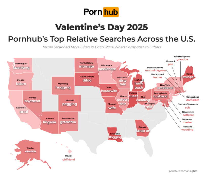
I find it mildly interesting that, aside from California, no state was a leader in a “common” porn. By that I mean go look at the top 100 videos/categories. No state took the lead in blowjob or step-anything.
This leads me to think that they were filtered out. I would say mathematically similar between states, except pornhub has released exactly that data on numerous occasions. But if they didn’t filter out anal, then how much more popular did it have to be?
I mean, there’s also a question of how they’re clustering searches. I’m guessing “hugging” and “Hugging” didn’t get their own separate category, but hugging all on it’s own is very specific for porn. If small categories outnumber big ones and they’re essentially filled at random, you’d expect that the biggest outlier would be a small category.


I always wonder what the actual statistical significance of these maps are. They always seem random, and it’d make sense if it’s essentially the same mix of a little of everything everywhere.
I believe the main purpose of releasing them is to generate publicity for their company that they might not be able to get otherwise in more mainstream media. Much like how the legal brothels in Nevada put out press releases about how they’re offering free services to first responders who helped on a recent disaster or something like that. It gets people talking about them and spreads awareness about their offerings.
Interesting, I hadn’t heard of that. But yes, they aren’t academics and don’t need their data to actually say anything.
Pornhub actually has a pretty good blog that goes into detail on all kinds of trends. You might find answers there.
You’ll find your answer in the gray text above the map.
No, no I wouldn’t.
“More often” could be by one search in a total set of 1,000,000, which basically is never going to be statistically significant - it could just be random chance, and not an actual trend. That goes in both absolute and relative terms.
I find it mildly interesting that, aside from California, no state was a leader in a “common” porn. By that I mean go look at the top 100 videos/categories. No state took the lead in blowjob or step-anything.
This leads me to think that they were filtered out. I would say mathematically similar between states, except pornhub has released exactly that data on numerous occasions. But if they didn’t filter out anal, then how much more popular did it have to be?
I mean, there’s also a question of how they’re clustering searches. I’m guessing “hugging” and “Hugging” didn’t get their own separate category, but hugging all on it’s own is very specific for porn. If small categories outnumber big ones and they’re essentially filled at random, you’d expect that the biggest outlier would be a small category.