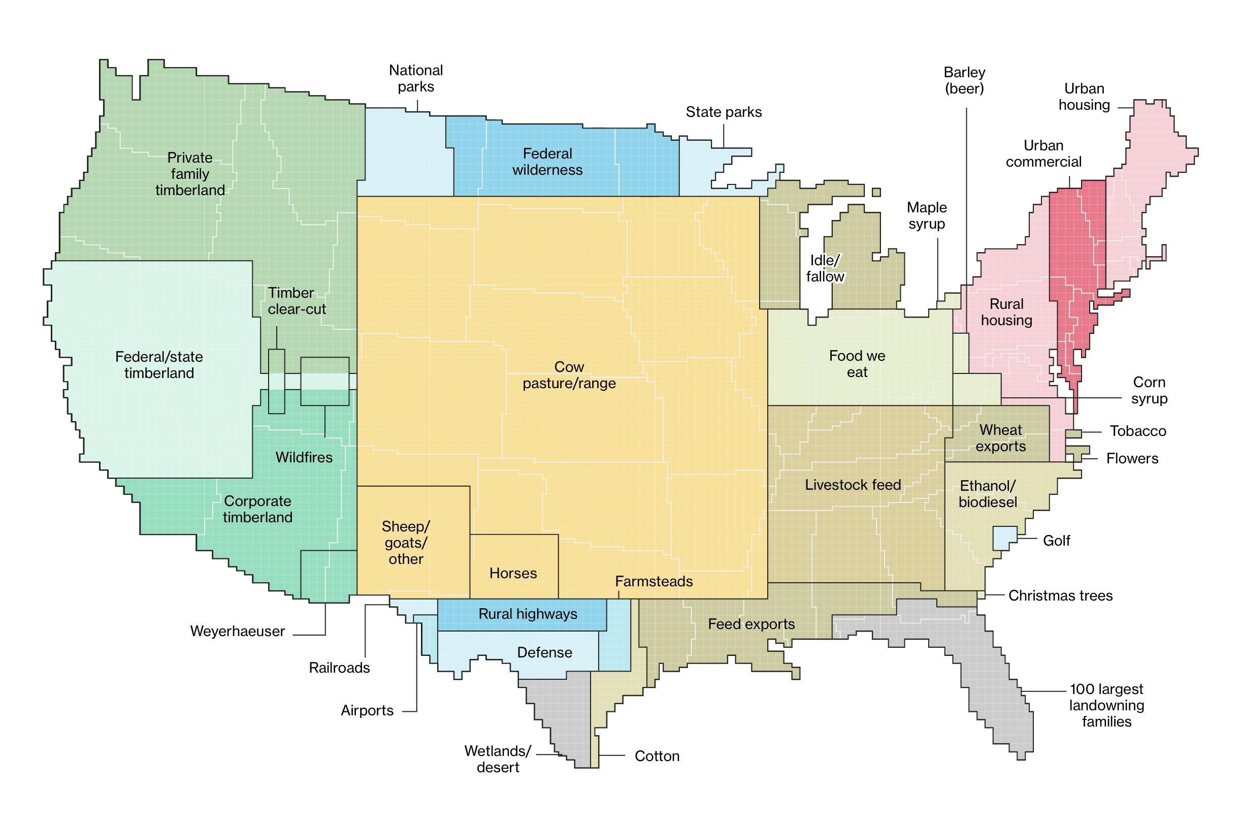
I think the graphic would be better if some of the data were nested by size and relationship. IOW Agricultural land would have grazing, food production, feed production, etc. in decreasing size nested over an area. Might give greater sense of how much land is used for ag. Same for forestry; Forestry, parks, commercial logging, etc.

I think the graphic would be better if some of the data were nested by size and relationship. IOW Agricultural land would have grazing, food production, feed production, etc. in decreasing size nested over an area. Might give greater sense of how much land is used for ag. Same for forestry; Forestry, parks, commercial logging, etc.