

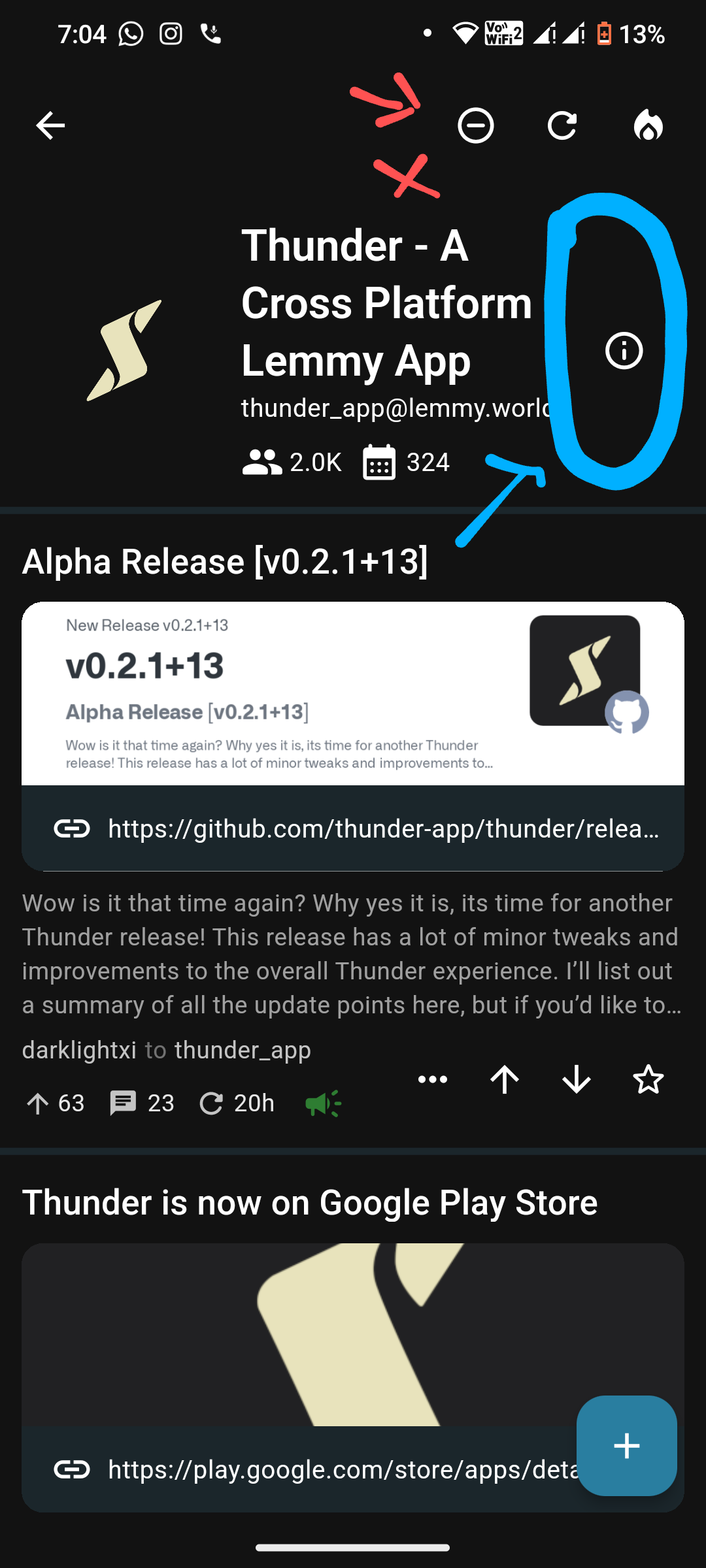
The button is too far up, plus it’s kinda hard to tell what it is until you’ve tapped on it.
I suggest a larger button, like the “New Post” button at the bottom. It can be either vertically below that Info button, or maybe both of them shifted below the header(?). That would make it more Material-ly and more UX friendly too.
Themks.
Maybe a red icon with this? https://pluspng.com/img-png/exit-png-exit-icon-1600.png
Absolutely. Also, the location could use modification.