Oh really? Huh, I remember it being a bit more condensed…idk, maybe it was bugged for me earlier. Either way, thanks for checking in!
Oh also, some minor feedback: the color used for the ‘Reply’ swipe doesn’t really fit the rest of the app’s aesthetic imo. Then again, it’s just a matter of taste.

Seems like the line spacing is a bit out of whack, definitely not as condensed as it should be (especially obvious in comments).
Are you able to share some screenshots?
Sure. I’m not sure if I just dreamed it up or something, but I remember there being less space between lines.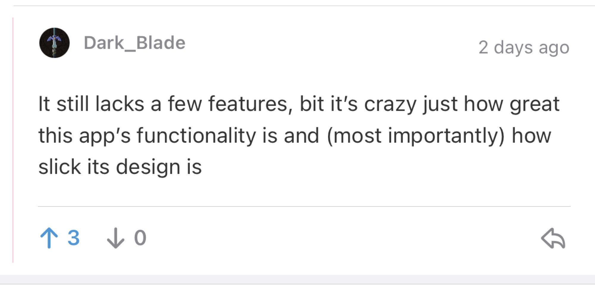
Across the board it should be that line-height.
Oh really? Huh, I remember it being a bit more condensed…idk, maybe it was bugged for me earlier. Either way, thanks for checking in!
Oh also, some minor feedback: the color used for the ‘Reply’ swipe doesn’t really fit the rest of the app’s aesthetic imo. Then again, it’s just a matter of taste.
That’s a placeholder at the moment. I’m using the same colour as the “success” toast so it is a bit wonky haha.
Ah. Well, I’m glad there’s potentially a better color in the works lol