
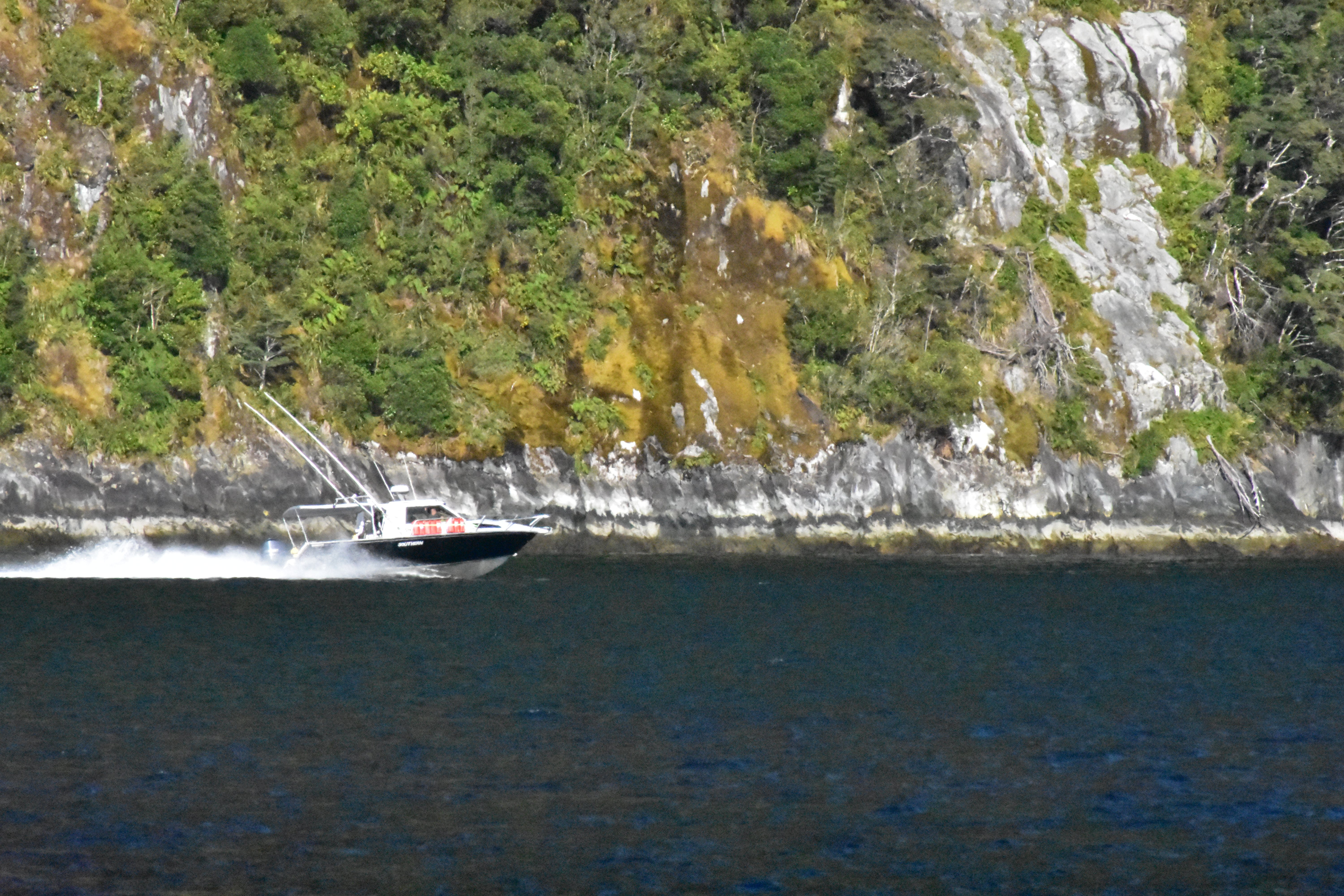
Part of me absolutely loves this picture, but part of me thinks maybe I should’ve done something differently. I’m interested to hear others thoughts.
Things I like:
- I really like the contrast between the dark water and the brightness of the cliffside.
- I also like the way the wake behind the boat appears
Things that could be improved:
-
Would it be better if the boat was on the right side of the frame? I feel like where it is right now cuts off some of the wake and detracts from the photo.
-
Also, while I like the division between light and dark, should it be framed higher so there is less of the water and more cliff? It just feels like a lot of the water is dead space to me.
I very much agree with your own critique especially the cliff side - it’s beautiful! And the wake of the boat very much emphasizes the speed of the scene.
As for your questions: I think the photo is great as-is with the positioning of the boat. Very similar to a photo of someone walking it’s nice to see the path/destination of the subject - just like we can see where to boat is headed.
The photo might be better as a wide shot to see more of the scenery just to give the viewer more of an idea of what is going on. I feel like the boat as a subject sits in a weird spot as far as the zoom of the lens. It’s not quite tight enough to see too much detail of the boat itself and not quite wide enough to see the scenery. So maybe it would be beneficial to pick one or the other. Just food for thought.
Less water and more cliff would be nice as well but it is neat how the boat is “cutting” the photo in half.
Personally, I think it might would be fun to lower the shutter speed and get a tracking shot to emphasize the speed of the boat. The wake is already blurry so you wouldn’t lose out there, but you would lose detail in the cliff side. The water would also appear more smooth so those would just be things to consider.
And a side note: is the photo a bit blurry or is that just compression from the site? Hard to tell as I’m not too familiar with how image hosting works here.
Also I’m gonna pin this post for a while because I think it’s a great example of critiquing your own work! Great job :D