You’re now able to theme Alexandrite a lot more, I’m excited to see what color schemes you all can come up with!
alexandrite.app - [email protected] - Github
There’s now a light mode! Alexandrite will now detect your system’s default color scheme and use that, but you can force dark or light mode in the settings. This is the default hue/saturation on light mode:
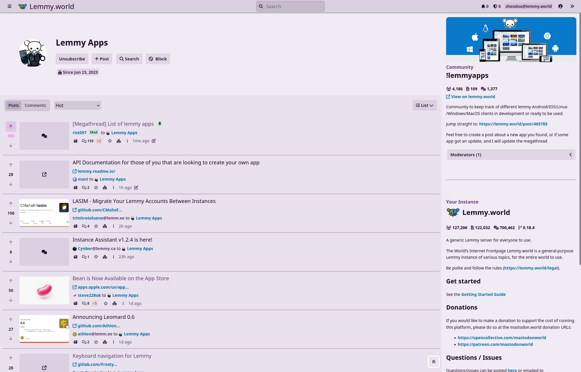
You can also change the saturation to make it as gray or as colorful as you want, plus you can customize the hues of links and up/downvote buttons (downvotes in screenshots just for demonstration!)
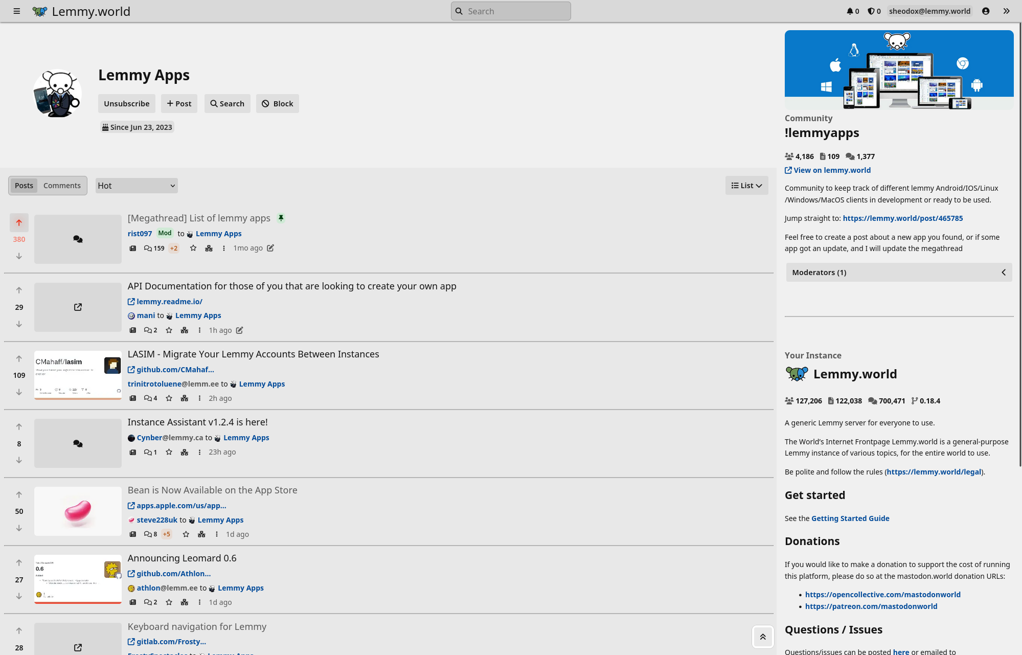
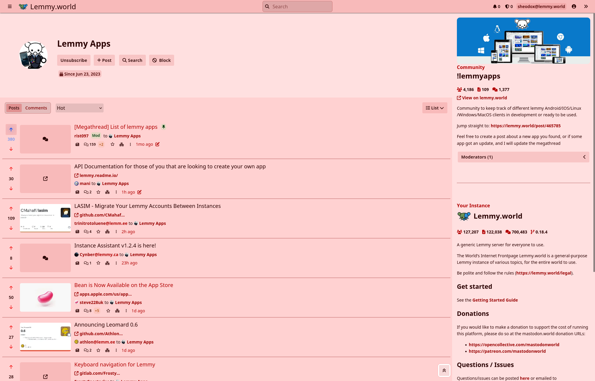


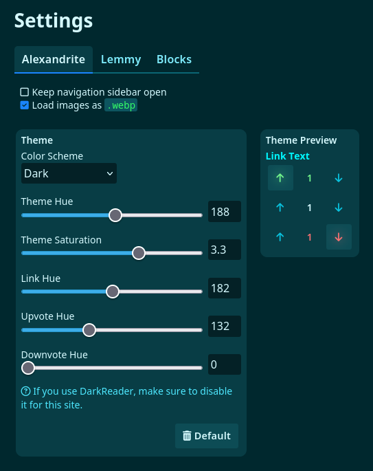
Here are the settings for themes now. There are numbers next to all the sliders to make it easier to share customizations! I might add a few presets in the future.
Posts look a little nicer. The content on them shows using similar styles to the previews on the cards. The “View Source” button is now a small button in the top right corner of the post.

Some 0.7.0 features I didn’t mention here before:
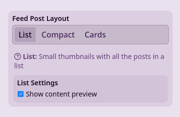
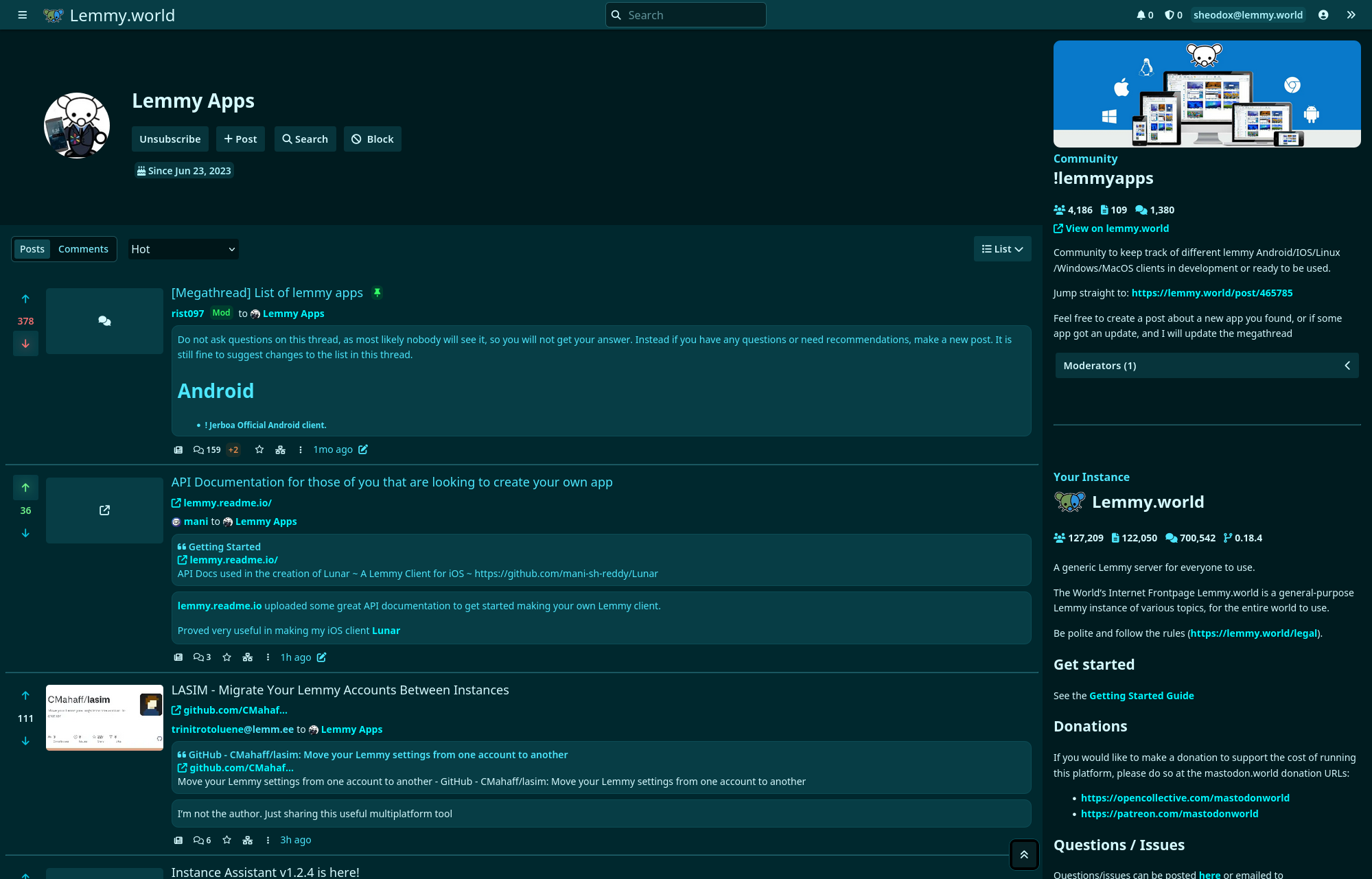
There’s an option when using the “List” post layout that shows a preview of the post content like the card layout does.
Oh speaking of version numbers Alexandrite now releases with version numbers! You can find the version number in use on the “About Alexandrite” page. You can read more on the version number announcement.


great ! what do you think of
hto go to the parent comment ?Good idea!