
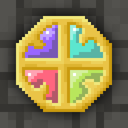
The colors and shading on the new runestones make them difficult to differentiate visually, especially with low screen brightness or night mode. I often play on low brightness at bedtime and it’s really hard to see. There needs to be more contrast between the color on the stone and the stone itself.
Stylistic comment: the new sprites for runestones and seeds look like eggs. Too perfectly round in their shape
Question to Evan: what’s your preferred way to provide beta feedback? This is my first time getting involved in beta even though I’ve been playing for 10+ years
deleted by creator
I didnt do anything to you but you are obviously ready to lash out.
I don’t have to take this from someone like you
deleted by creator
Oh trust me, j know people like you, i know im now on your crosshairs and you will bully me any chance you get.
But I hope you know you are human garbage for it
deleted by creator