There is currently a major lack of semantic ID's and classes in the UI markup. This makes everything from detecting if the site is running Lemmy (for userscript) to theming more difficult than nece...
Notably for this community is the inclusion of the “lemmy-site” class on the #app div
Please check the PR and let me know if there’s anything I missed as far as good candidates for CSS targeting.
I tried to use a light touch while being mindful of the different ways people may want to style both visible and parent structures
I just pushed a commit for the more-btn suggestion. The others look a bit more involved, but I think they are do-able.
However I’m going to leave them for a separate PR as I would like this make sure this one gets into 0.18.
That said I should be able to look into them next, just want to break this off and get it merged.
Having all the various interaction buttons labeled, having a separate left-hand vs. right-hand footer location etc. would be helpful.
Being able to have a link from a comment to scroll up to the parent or up to the root like HackerNews would be fantastic but is currently kinda difficult without a lot of looping (slow on big threads)
the thing that bugged me (and continues to do so) is the different uses of .container-lg among the pages.
It is used differently between the community, search, main, and alert/messages area and it killed me trying to figure out the spacing relative to each use. In some cases I gave up…


it was SO painful and hacky. Still will be until this gets out there.
Please check the PR and let me know if there’s anything I missed as far as good candidates for CSS targeting. I tried to use a light touch while being mindful of the different ways people may want to style both visible and parent structures
looking at it now…
Here’s a few that would be helpful based on stuff I ran into in my userscript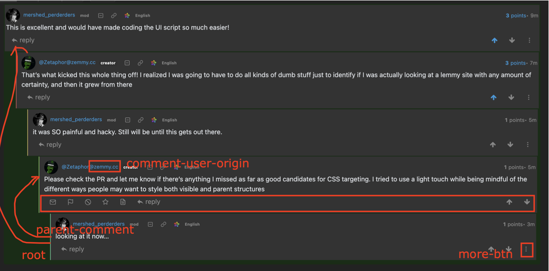
I just pushed a commit for the more-btn suggestion. The others look a bit more involved, but I think they are do-able. However I’m going to leave them for a separate PR as I would like this make sure this one gets into 0.18. That said I should be able to look into them next, just want to break this off and get it merged.
Having all the various interaction buttons labeled, having a separate left-hand vs. right-hand footer location etc. would be helpful.
Being able to have a link from a comment to scroll up to the parent or up to the root like HackerNews would be fantastic but is currently kinda difficult without a lot of looping (slow on big threads)
the thing that bugged me (and continues to do so) is the different uses of
.container-lgamong the pages.It is used differently between the community, search, main, and alert/messages area and it killed me trying to figure out the spacing relative to each use. In some cases I gave up…