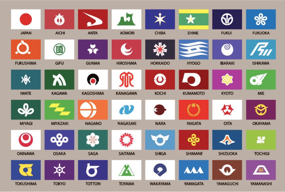
@JaettehjortM to VexillologyEnglish • 1 year agoFlag map of Japanese prefectures. What do you think of the flags, unique and aesthetically pleasing designs, or glorified logos on single color backgrounds?images2.imgbox.comimagemessage-square10arrow-up1100arrow-down11file-text
arrow-up199arrow-down1imageFlag map of Japanese prefectures. What do you think of the flags, unique and aesthetically pleasing designs, or glorified logos on single color backgrounds?images2.imgbox.com@JaettehjortM to VexillologyEnglish • 1 year agomessage-square10file-text
minus-squaremagnetospherelinkfedilink3•1 year agoThe Hokkaido flag is my personal favorite. The Nagano flag, meanwhile, looks like the forgettable logo from an off-brand energy drink.
minus-square@[email protected]linkfedilinkEnglish3•1 year agoI couldn’t agree more. Over the whole set it has these qualities, some bangers, some logos for non-existent companies. Tokushima looks like a logistics company.


The Hokkaido flag is my personal favorite. The Nagano flag, meanwhile, looks like the forgettable logo from an off-brand energy drink.
I couldn’t agree more. Over the whole set it has these qualities, some bangers, some logos for non-existent companies.
Tokushima looks like a logistics company.