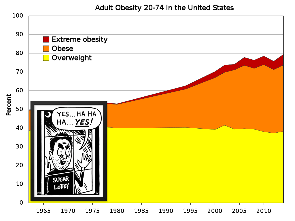
So, just to be clear, if I’m following correctly: the chart is incorrect. The error in the chart is that it ignores that obese people are also overweight, and “extreme obese” people are also both obese and overweight.
So rather than show the obese people as a subset of overweight, and extreme obese as a subset of obese, the chart is adding the percentages together to falsely represent each designation cumulatively.
Source? This graph seems made up as fuck.
deleted by creator
Yeah, that’s what the chart says, and about 40% are oveweight
deleted by creator
It does, it just calls it extreme instead of morbid.
So, just to be clear, if I’m following correctly: the chart is incorrect. The error in the chart is that it ignores that obese people are also overweight, and “extreme obese” people are also both obese and overweight.
So rather than show the obese people as a subset of overweight, and extreme obese as a subset of obese, the chart is adding the percentages together to falsely represent each designation cumulatively.
https://en.wikipedia.org/wiki/Obesity_in_the_United_States
Also only goes to ~2015