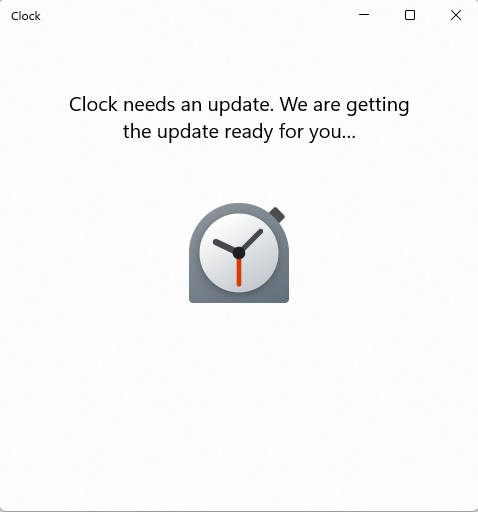
@doopen to Mildly InfuriatingEnglish • 1 year agoI just want to set a timer for MY FOOD WINDOWS WHY?imagemessage-square326arrow-up11.3Karrow-down130file-text
arrow-up11.27Karrow-down1imageI just want to set a timer for MY FOOD WINDOWS WHY?@doopen to Mildly InfuriatingEnglish • 1 year agomessage-square326file-text
minus-squaredual_sport_dork 🐧🗡️linkEnglish11•1 year agoAnd we made it better by removing several features, but we made the font really big and thin, and added a bunch of whitespace around everything so it takes up a ton of room. That makes it modern and “accessible,” see?
minus-square@[email protected]linkfedilinkEnglish5•1 year agohate how the touchscreen paradigm of windoes 8 never left

And we made it better by removing several features, but we made the font really big and thin, and added a bunch of whitespace around everything so it takes up a ton of room. That makes it modern and “accessible,” see?
hate how the touchscreen paradigm of windoes 8 never left