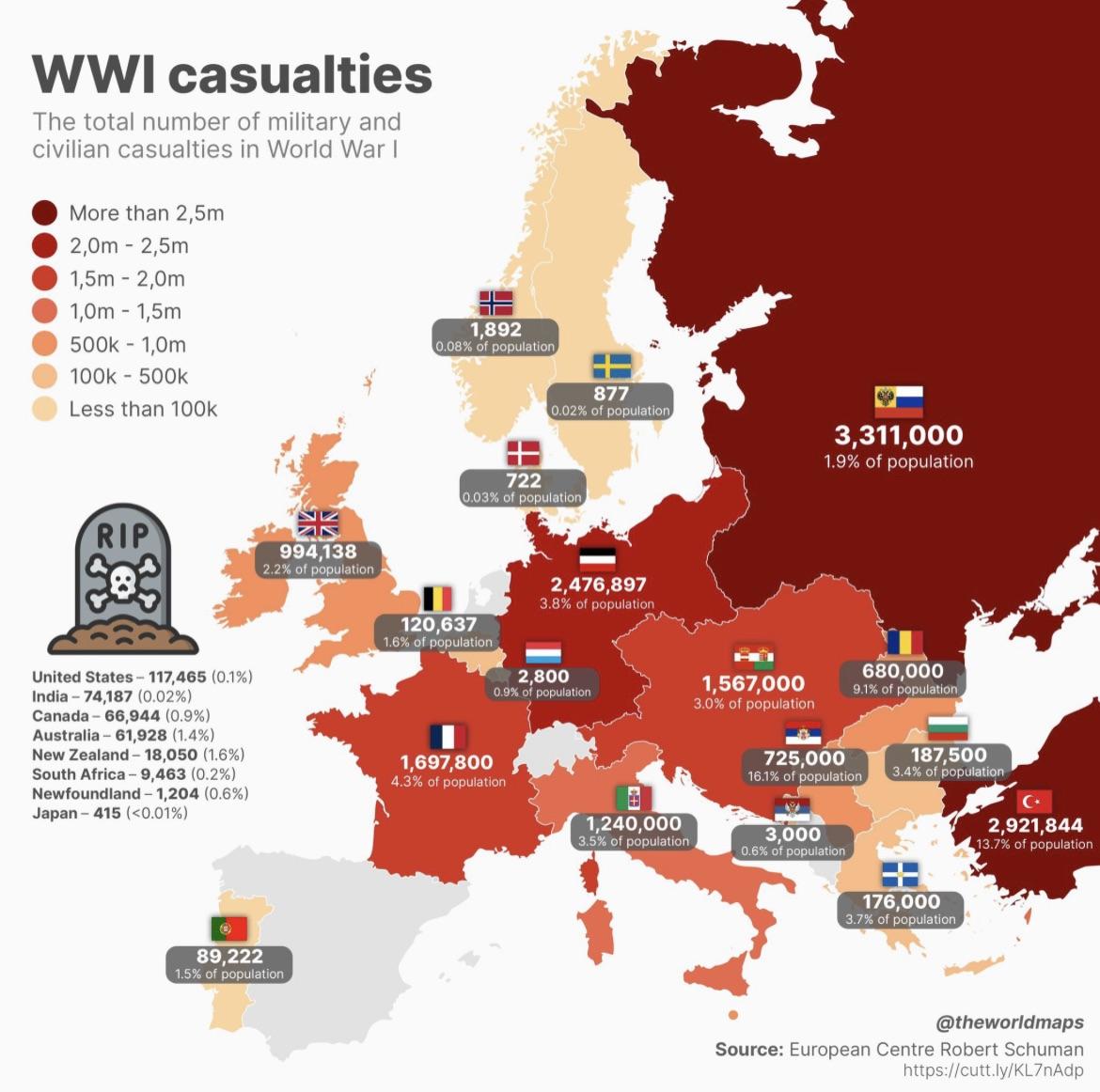
minus-square@[email protected]linkfedilinkEnglish13•1 year agoI hate charts where they use the absolute numbers for coloring. Obviously bigger countries will have more people and thus had more casualties. If you calculate the percentage already, use that number for coloring.

I hate charts where they use the absolute numbers for coloring. Obviously bigger countries will have more people and thus had more casualties. If you calculate the percentage already, use that number for coloring.