Hi all! New release. Let’s get into it.
Versions!
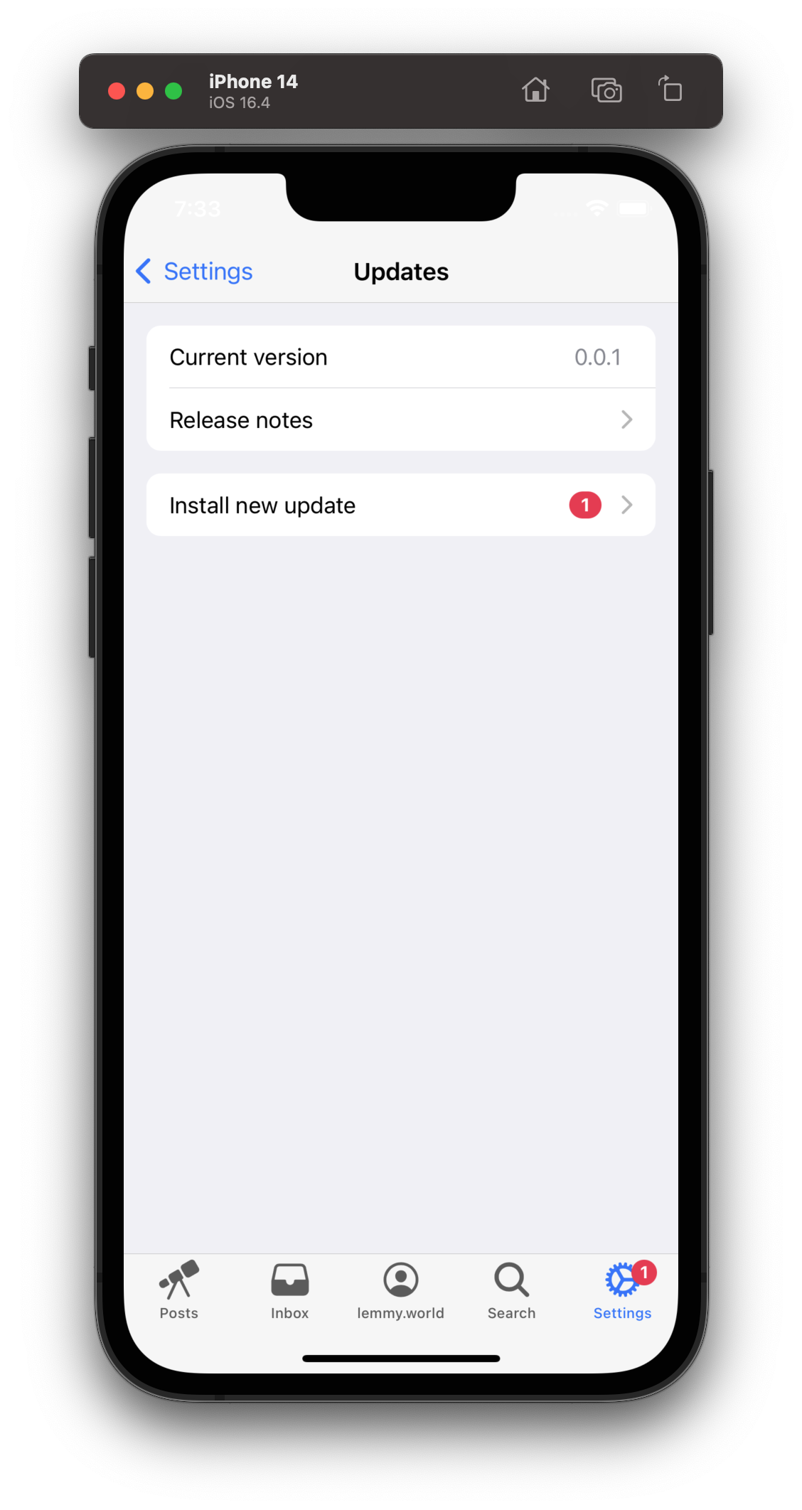
And it’s well overdue. This is version 0.2.0, and assuming you have at least 0.1.4, you can check in settings to confirm your version and get updates! It’s a much nicer experience then “please close and reopen the app and cross fingers”


Lemmy community links
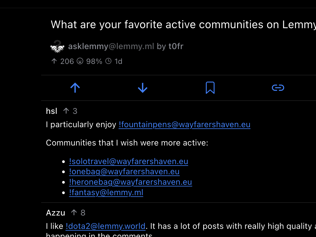
I have no idea what they’re called… but those handles that start with a exclamation mark? They now link inside the app! It’s much easier to subscribe to a community someone mentions.
Note: This is just for the format with an exclamation mark! There will be more work on internal app deep linking for posts, comments, etc.
Try it out! If you have v0.2.0, this should be tappable: [email protected]
Share your favorite communities below! (I want to subscribe, lol)

Swipe right to collapse a comment thread
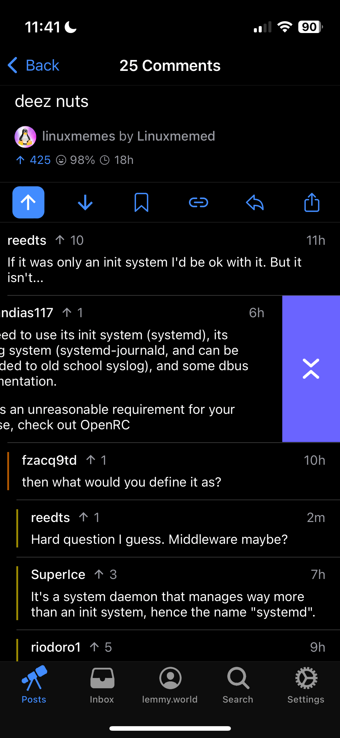
Just like Apollo, you can now swipe right to collapse! And swipe a bit further to reply, just like before.
In the future, these gestures will be customizable!

TONS of bugfixes
There have been a ton of little, but super annoying things fixed along the way.
What’s next
Posts (it would be nice to post these updated from wefwef…) Comment editing. And more bugfixes, of course!


The update process was great!
You can actually see in your screenshots, but the time and battery indicator text is in white whether the device is in dark or light mode. In light mode, the text should be black.
Ugh, that white status bar thing is in iOS limitation with web apps installed to homescreen with iOS transparent status bar. :(
https://social.harding.dev/@alex/110590855343602954
I might make the status bar non transparent as a quick fix, but not ideal since it requires the header of the app to be a solid color (it is now - but in the future I was planning on making it iOS-style translucent).
Elk has the same problem too, unfortunately.