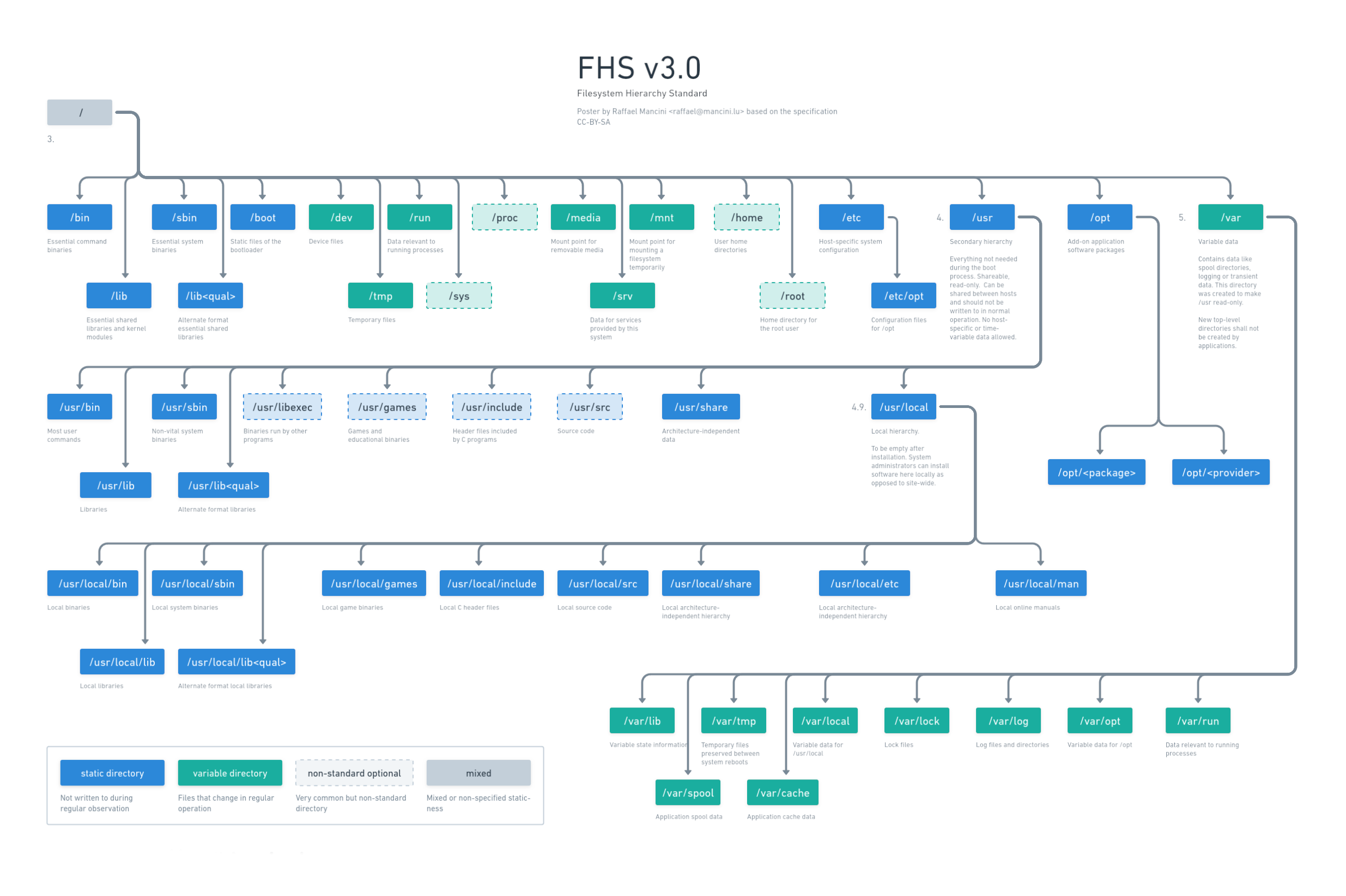
Hey, I’ve recently designed a Poster about the FHS since I often forget where I should place or find things. Do you have any feedback how to make it better?
I updated the poster: https://whimsical.com/fhs-L6iL5t8kBtCFzAQywZyP4X use the link to see online.

Dark mode

Old version


I really like this, but can I have a black background version please?
Added a black background version.
Not bad, but not quite what I had in mind as you see the blue carrot, lol. Would you perhaps share your project files?
I unfortunately did it in whimsical.com which is great but also closed if you don’t pay. https://whimsical.com/fhs-L6iL5t8kBtCFzAQywZyP4X is the best I can do.
You could create a Github repo for it and store it as an SVG file.
You could invert the colors in GIMP or similar.
That wouldn’t look as good tho. I want the black text to be white and the white background to be black not invert everything.